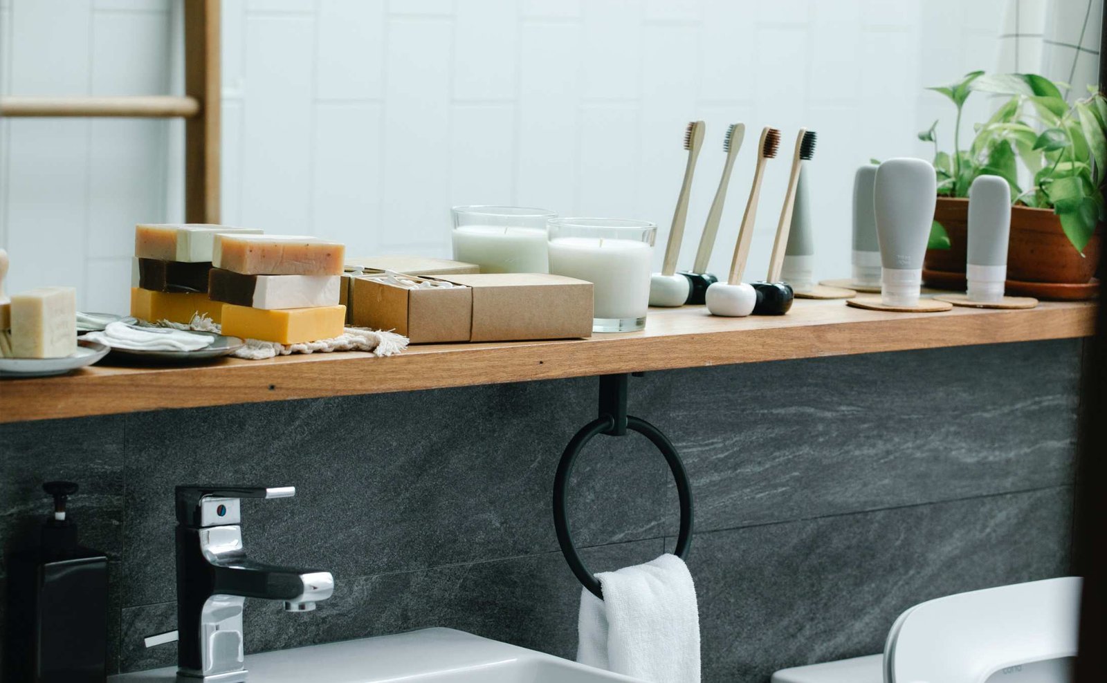
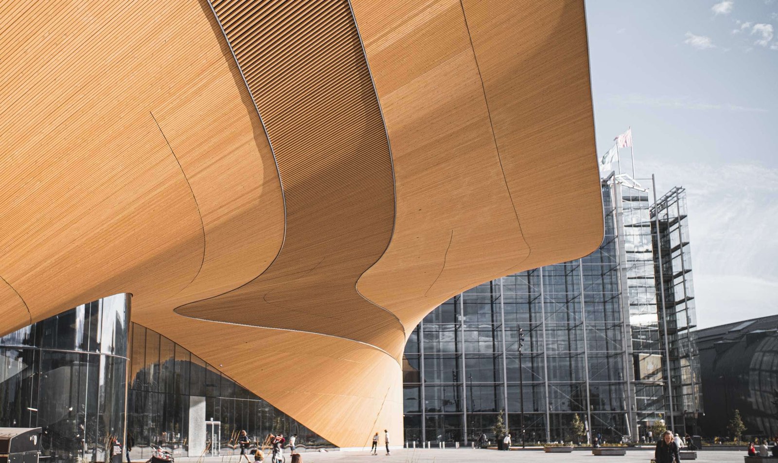
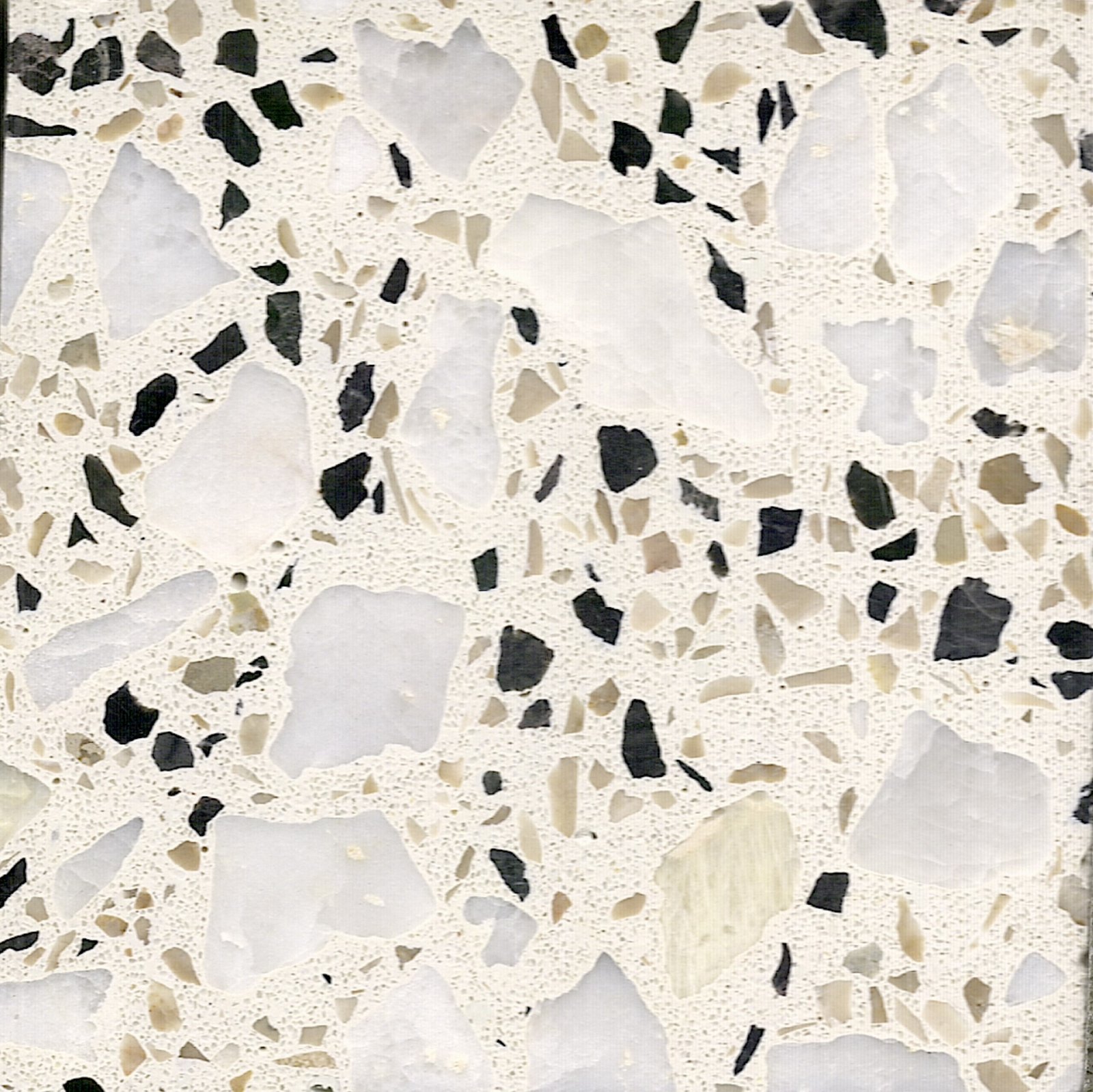
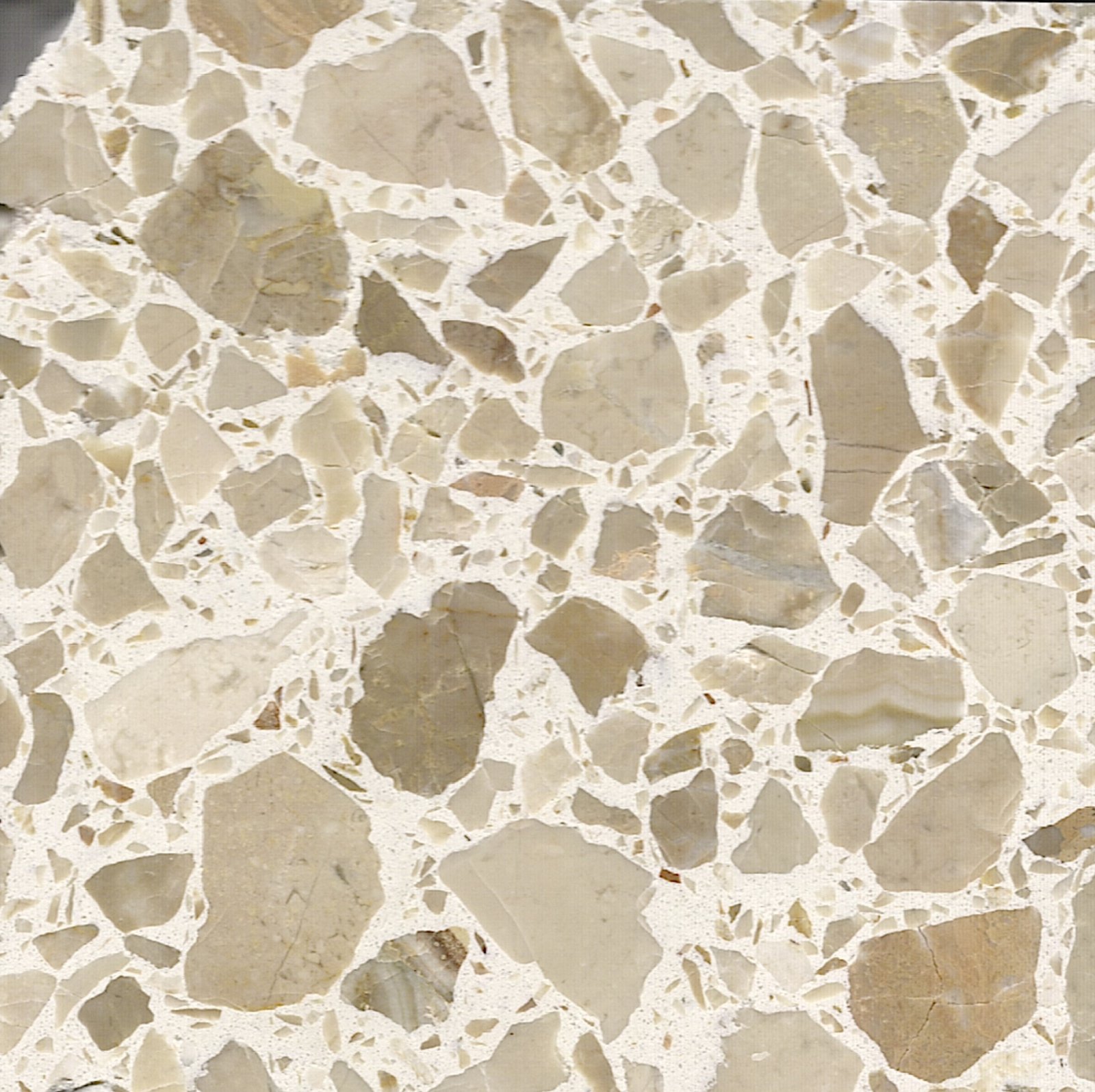
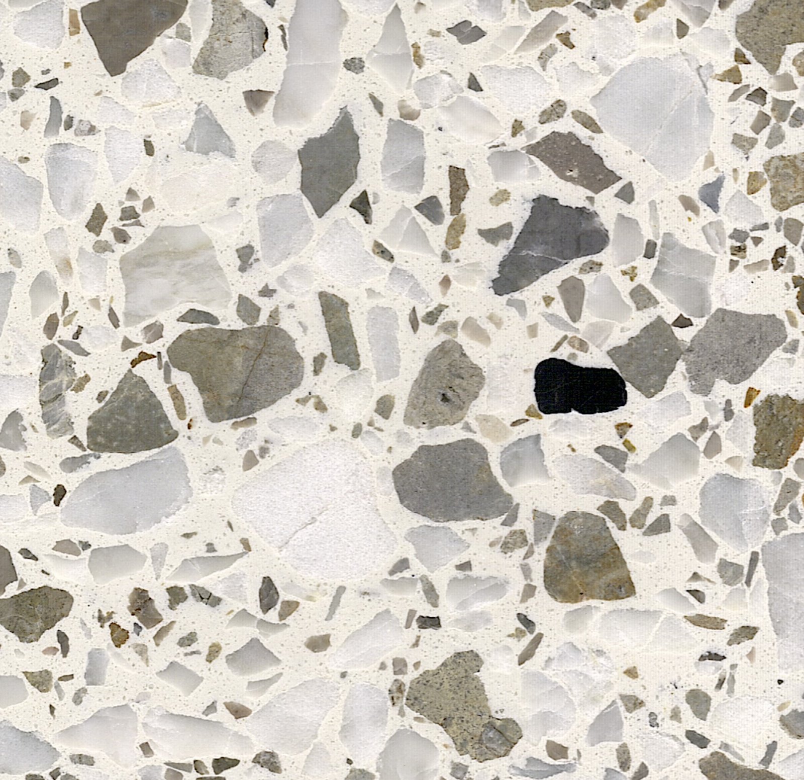
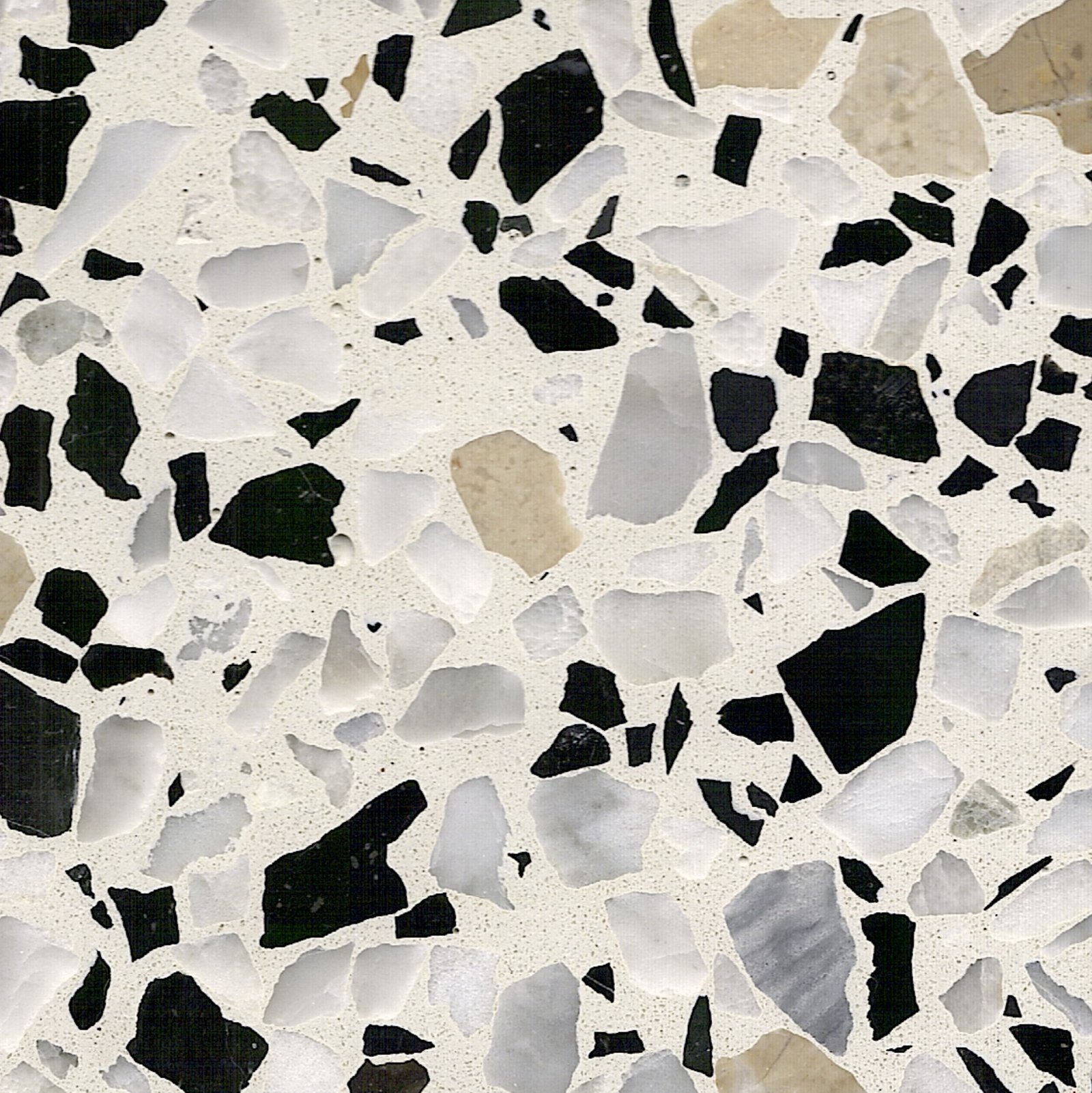
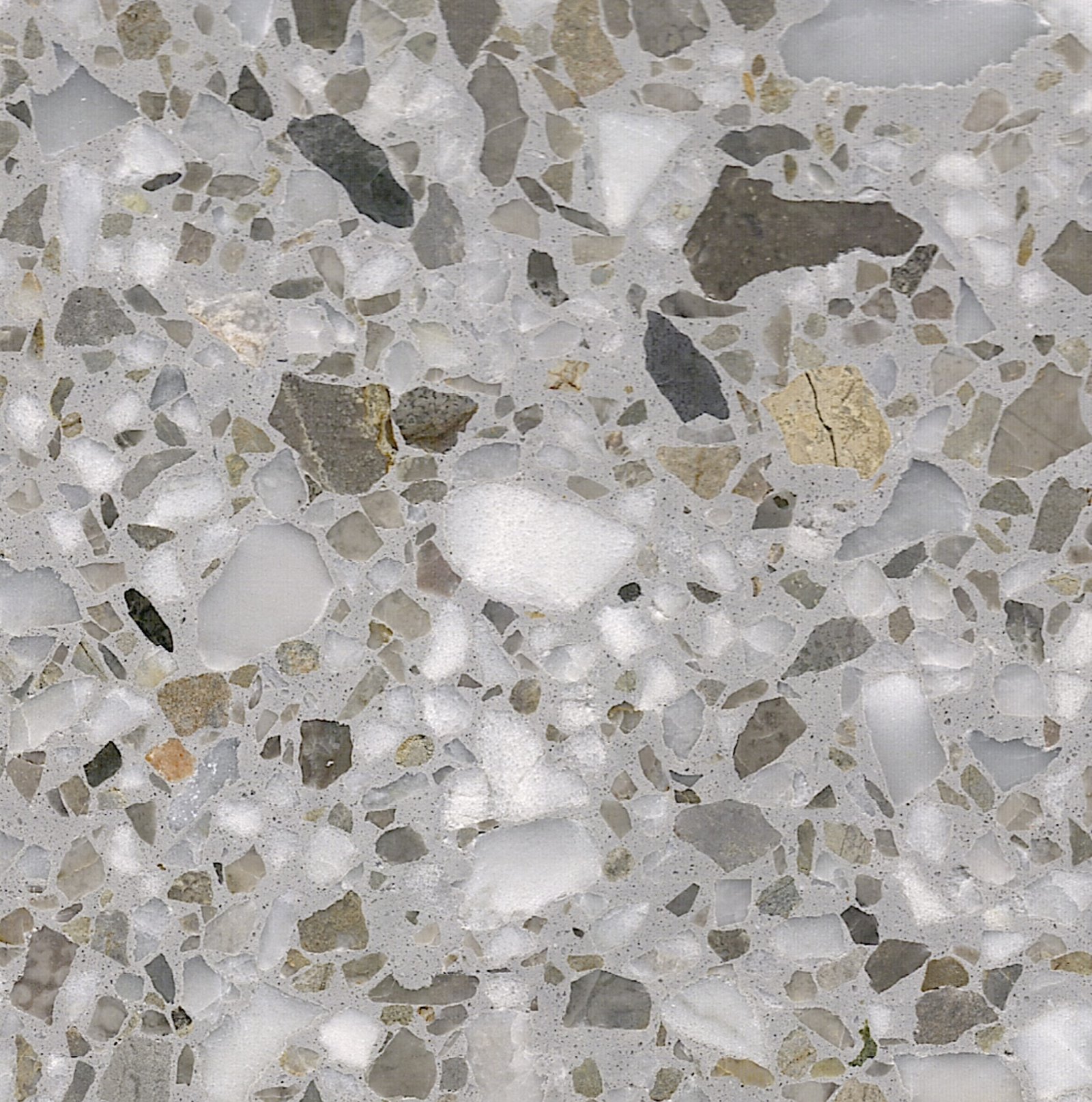
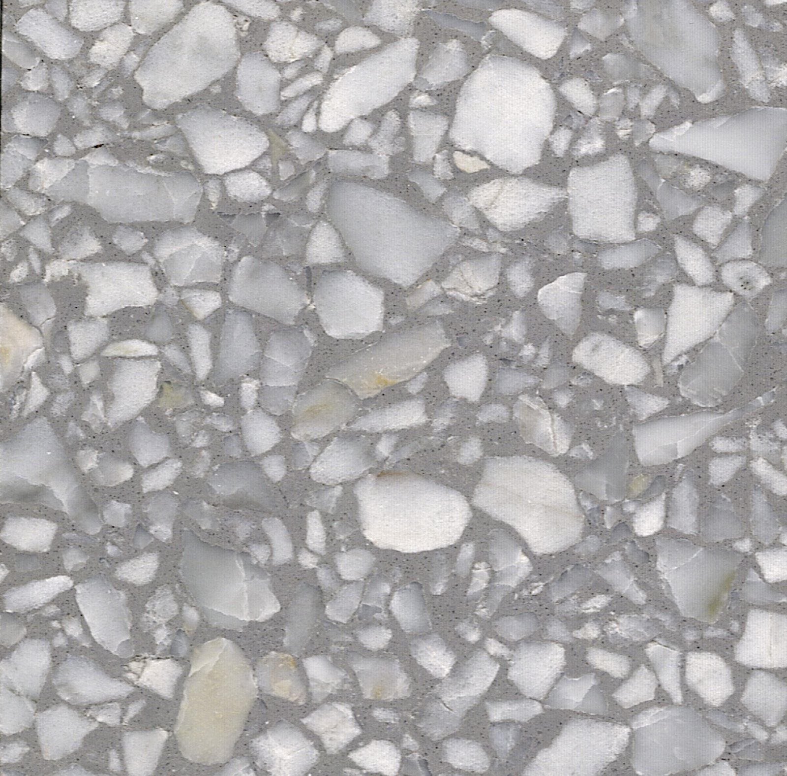
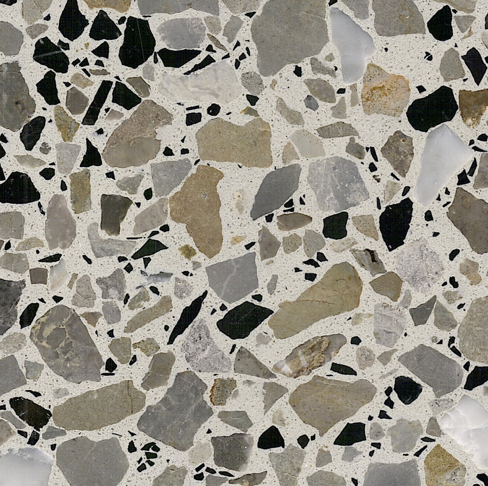
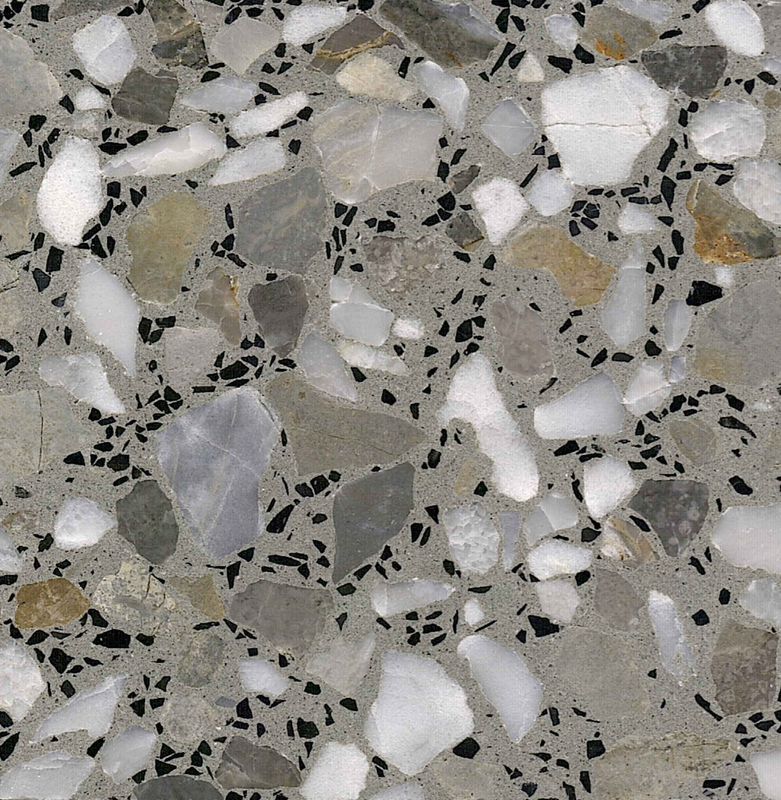
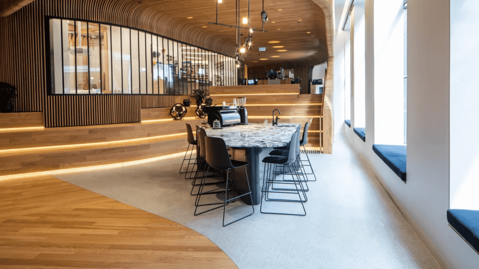
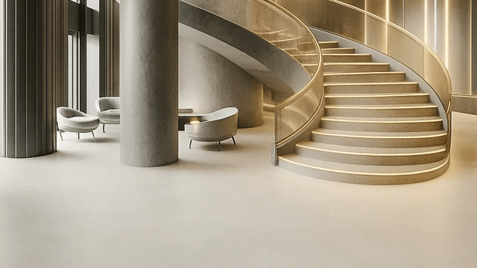
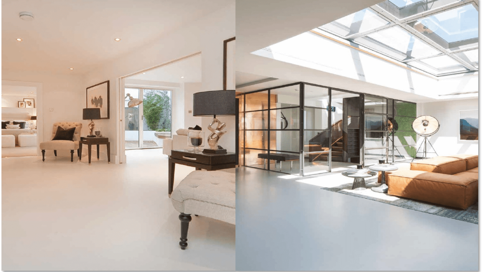
Use this section to outline the tone families, contrast levels and finishes you plan to apply across the project.
The diagrams below help you map how tones shift from space to space, without tying you to specific names.
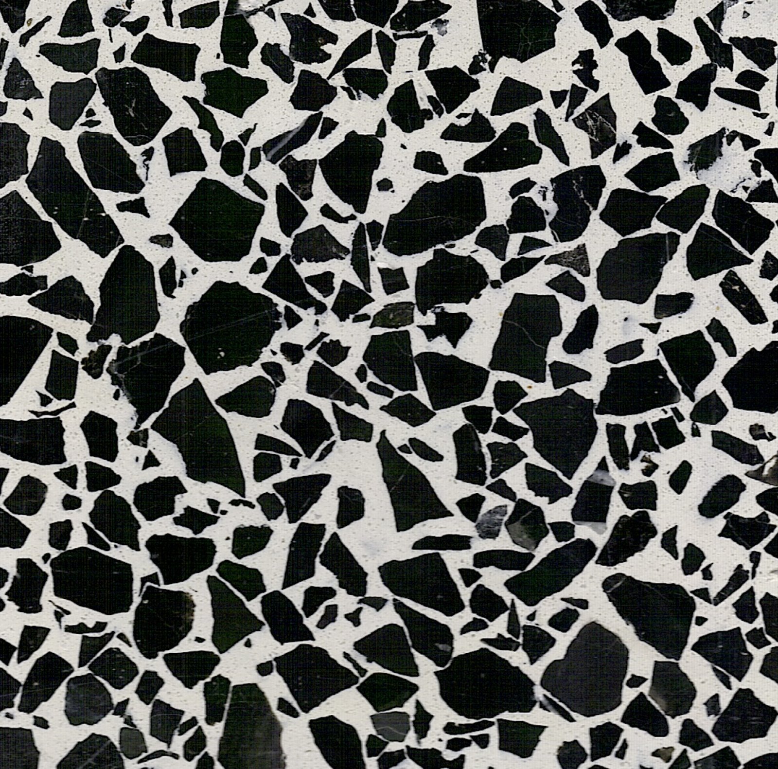
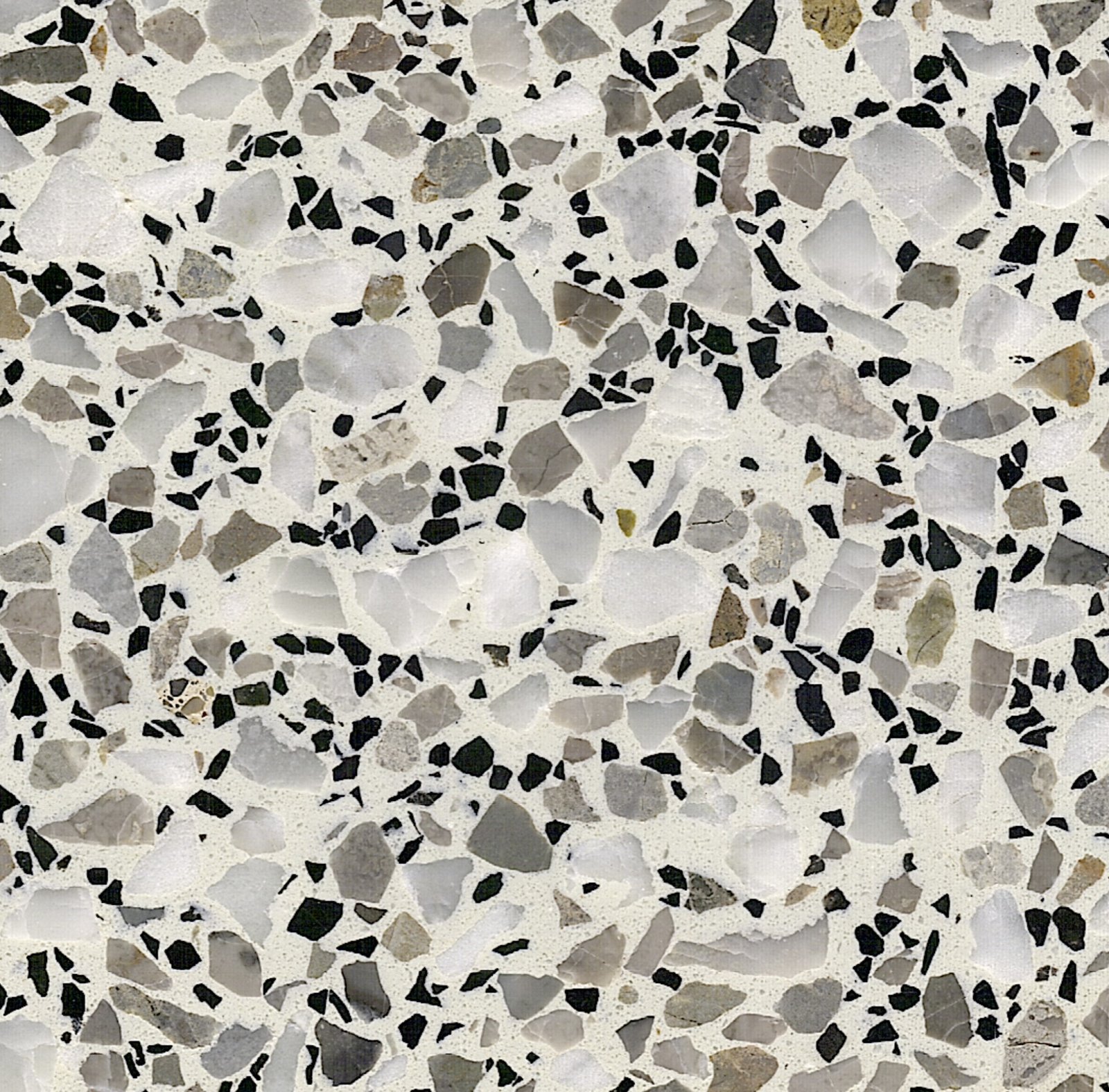
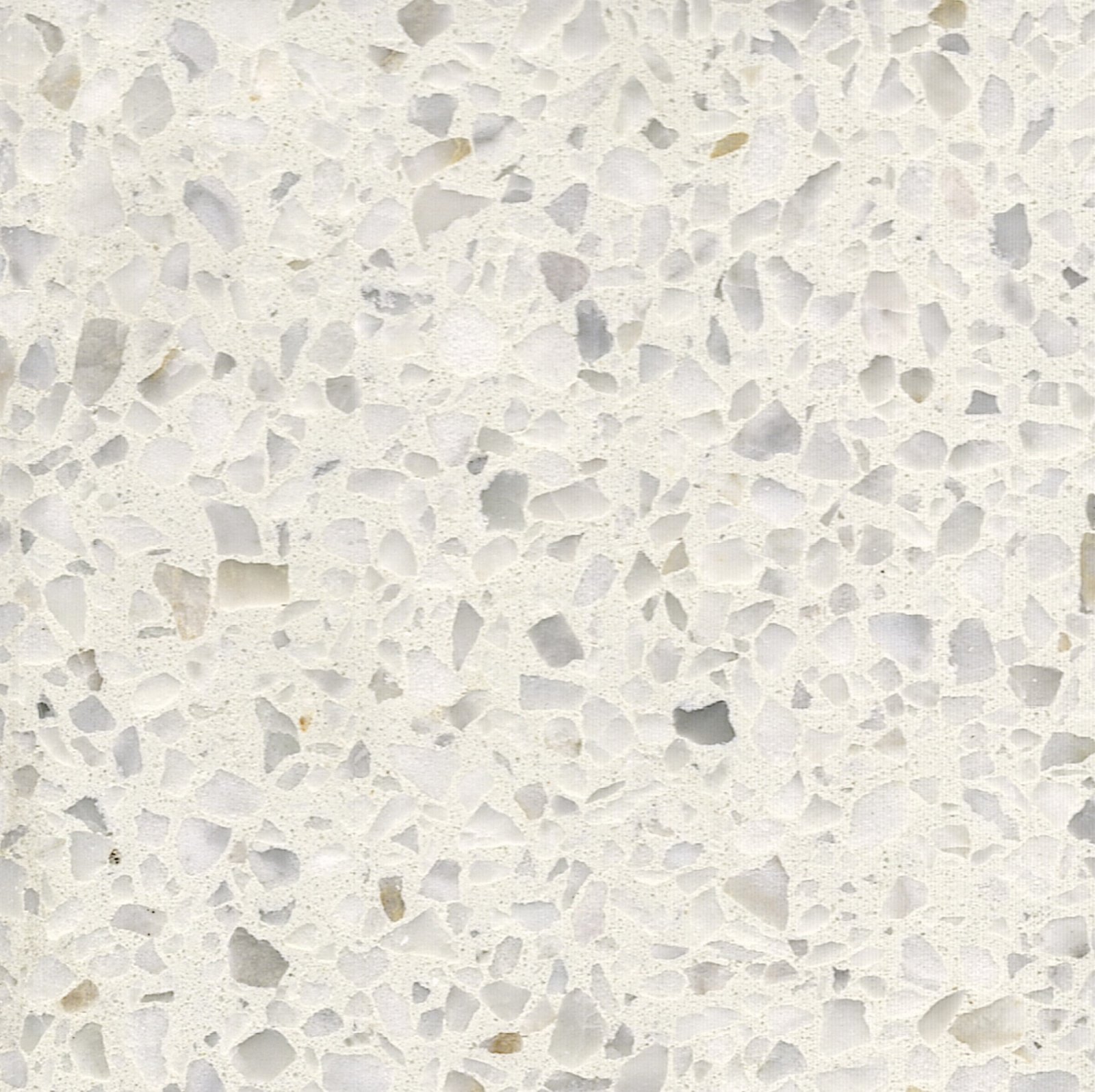
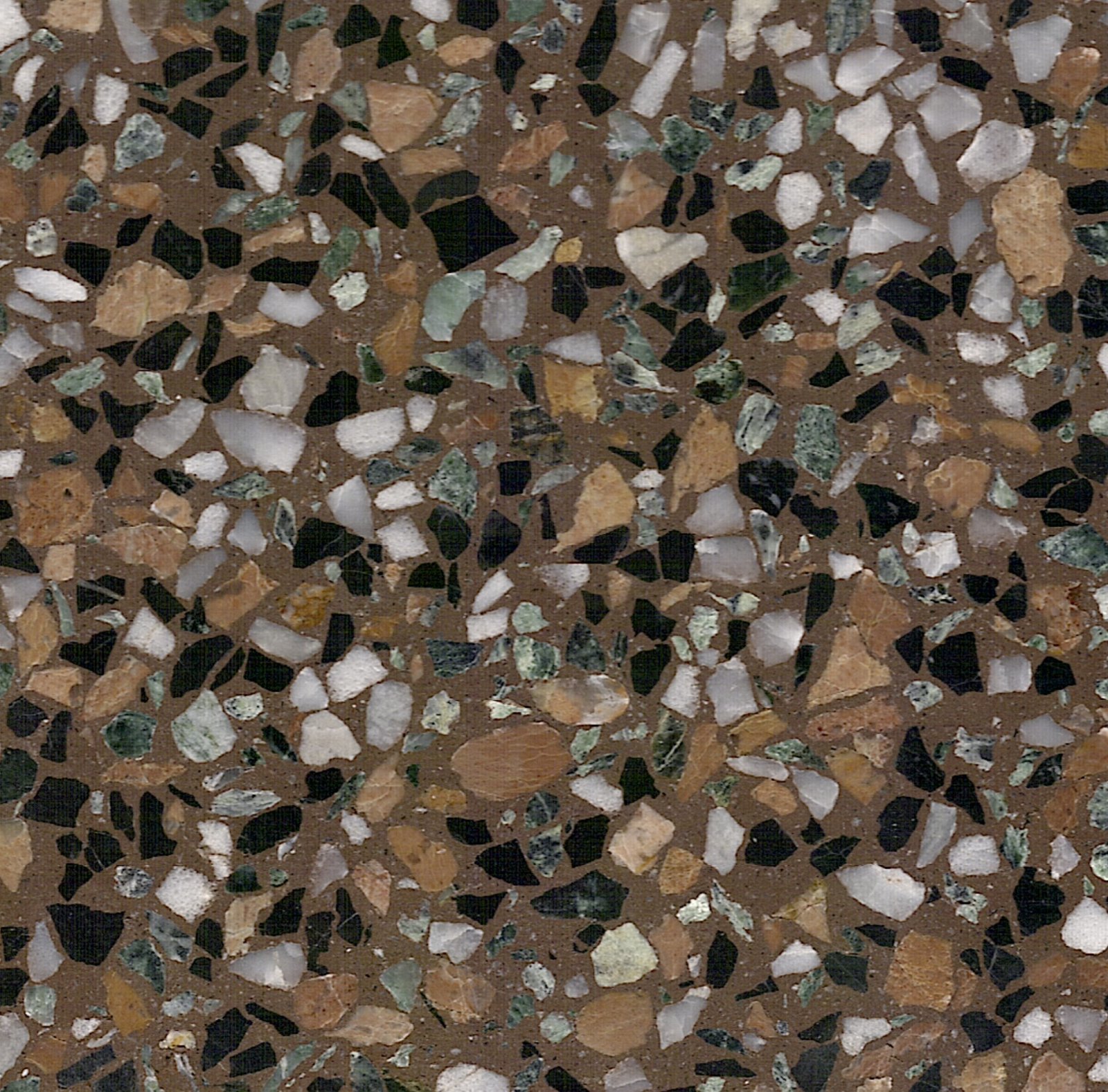
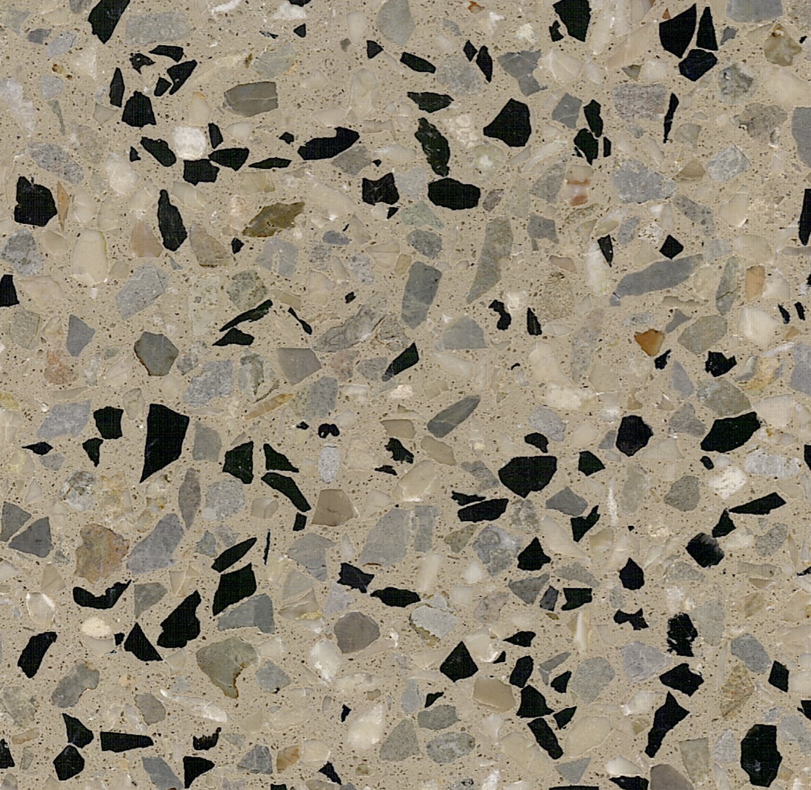
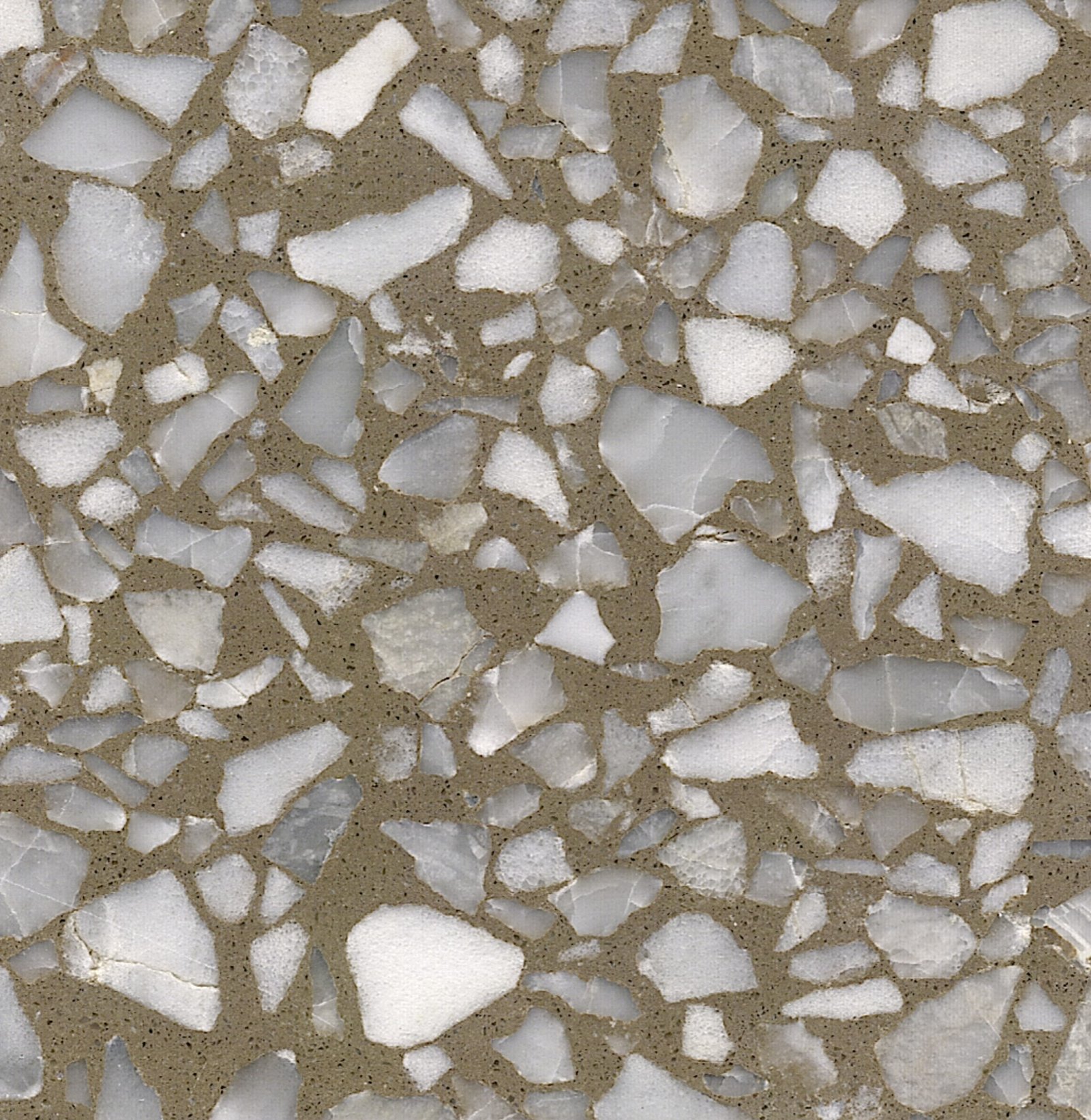
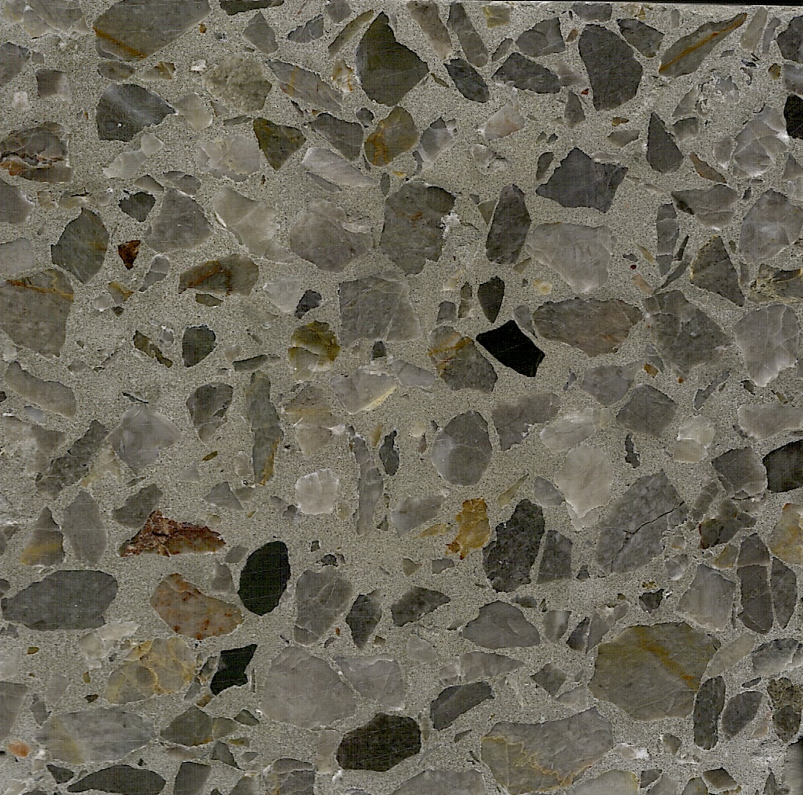
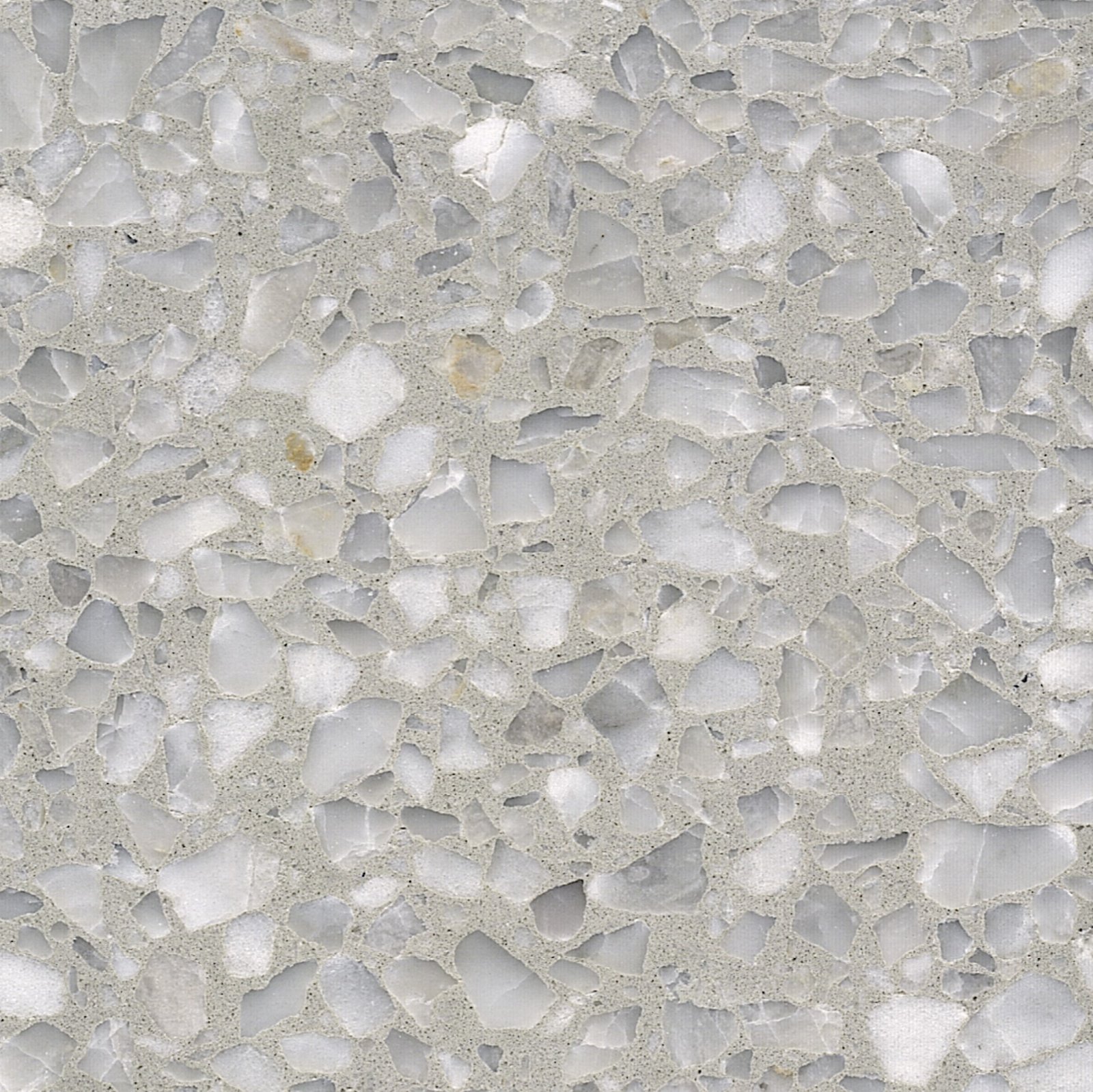
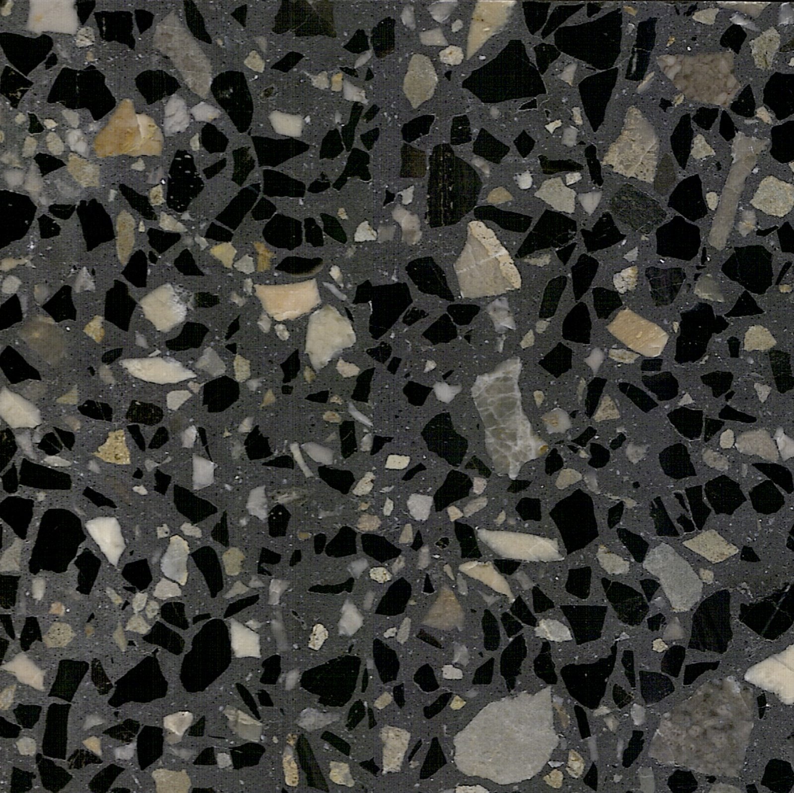
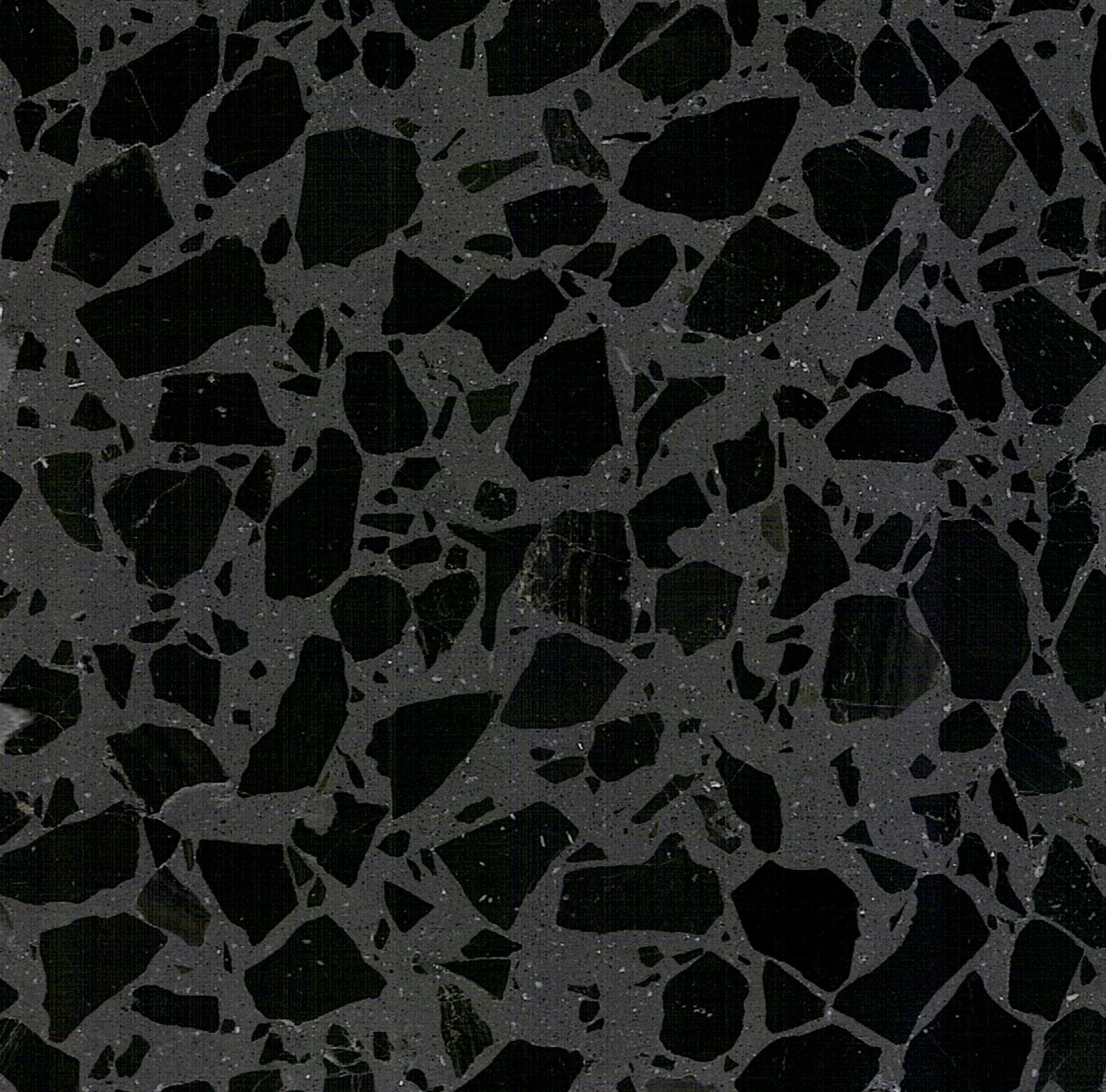
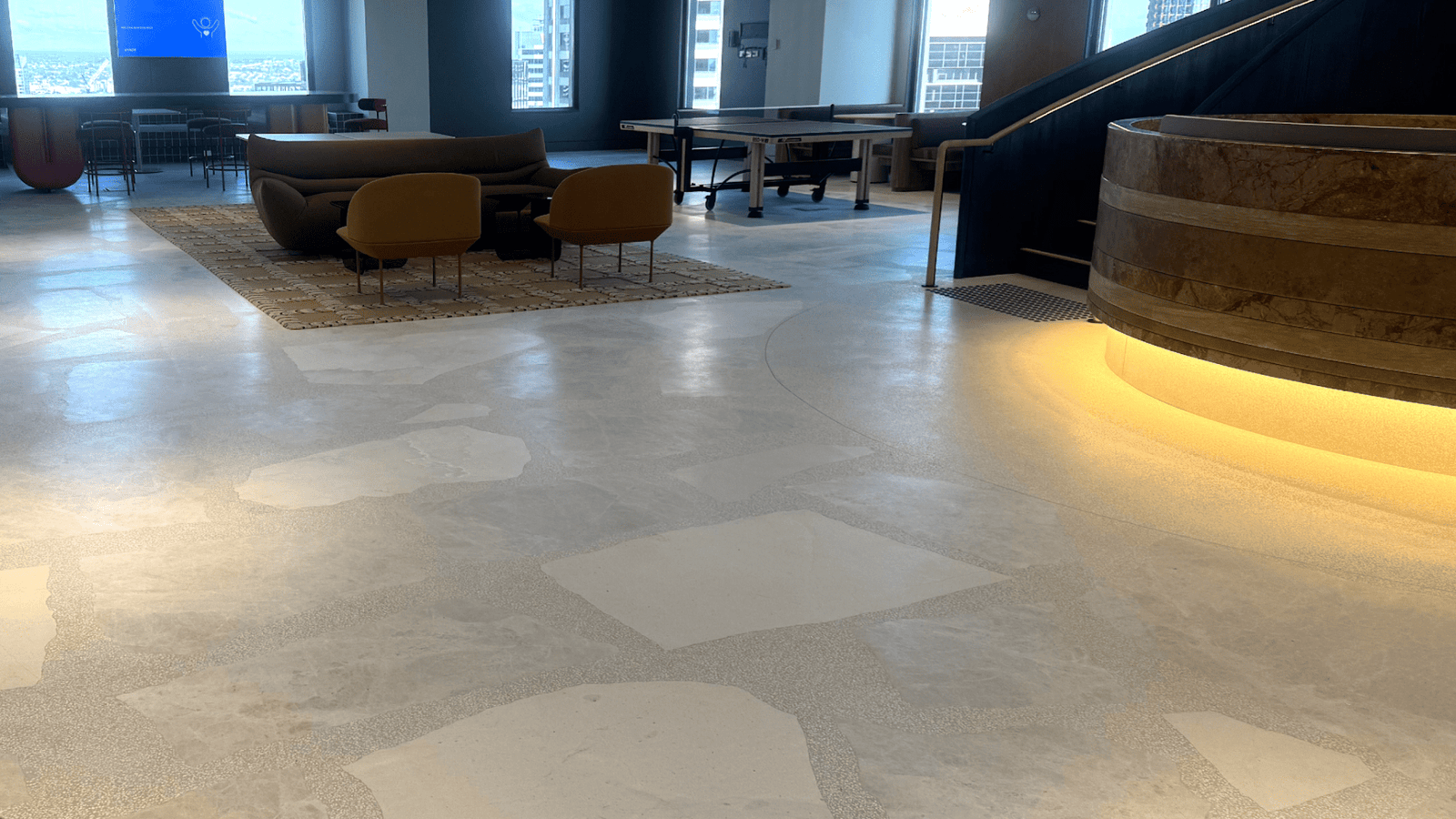
Tone hierarchy
Start by deciding which tone carries the background, which supports circulation zones, and which is reserved for feature areas.
1
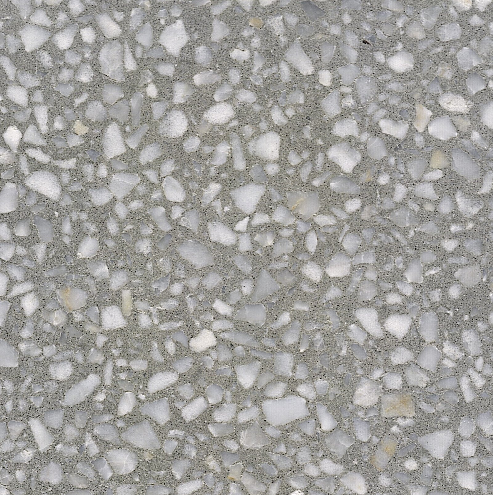
Background tone
Continuous, low-contrast tone that links most spaces together.
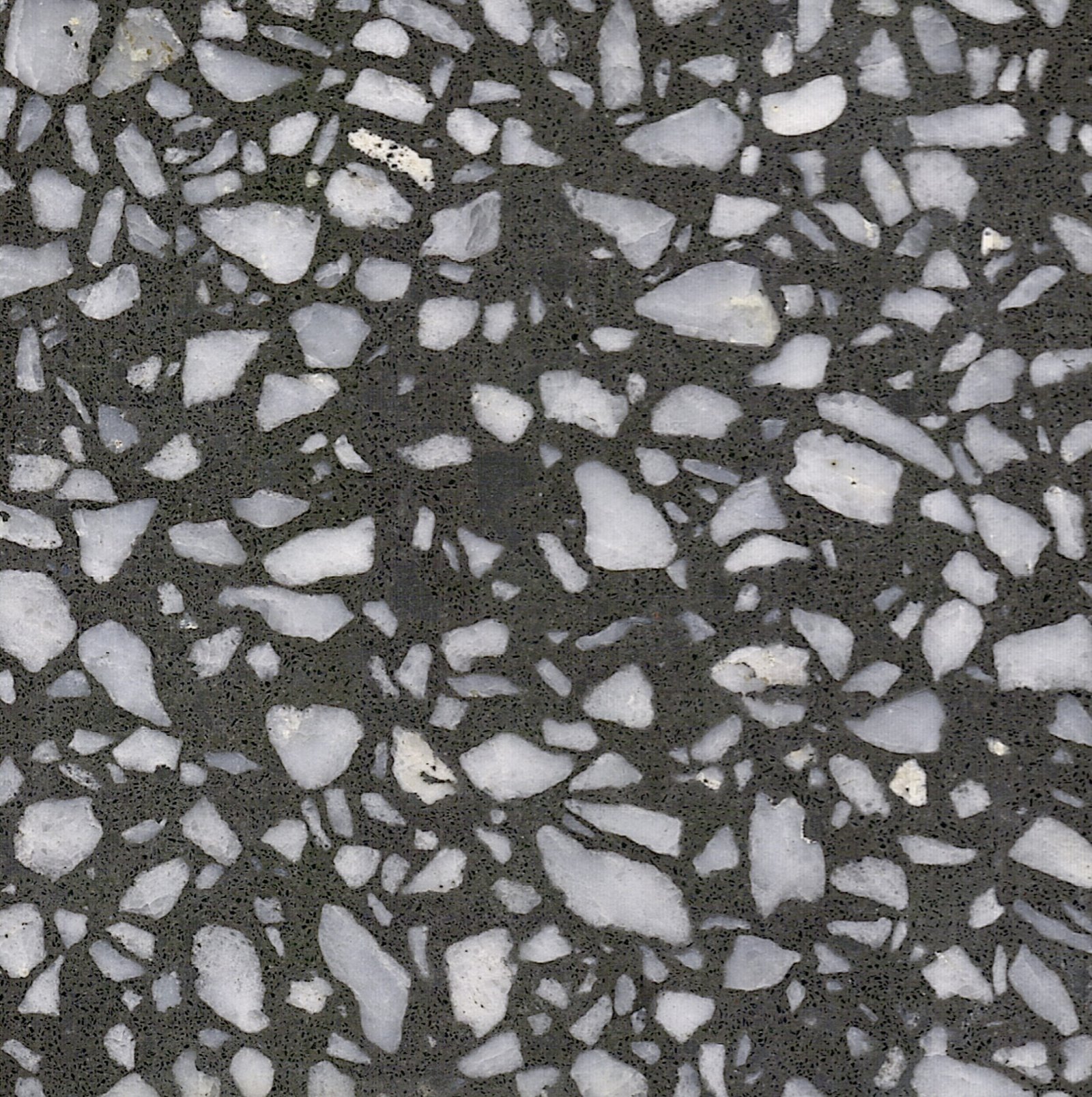
2
Primary tone
Used where activity is highest: lobbies, main corridors, shared working areas.
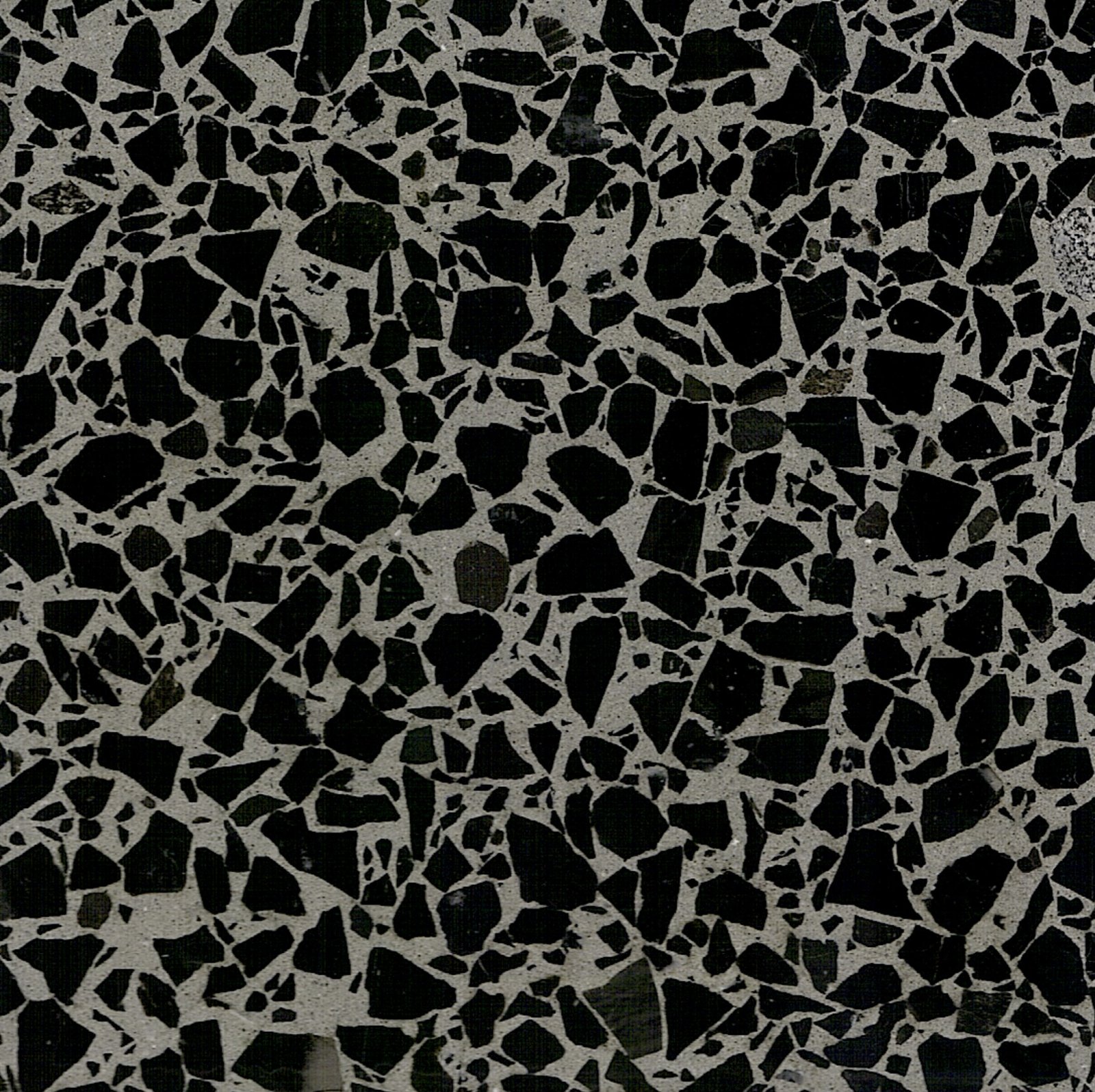
3
Accent tone
Reserved for key thresholds, focal walls, stairs or special zones.
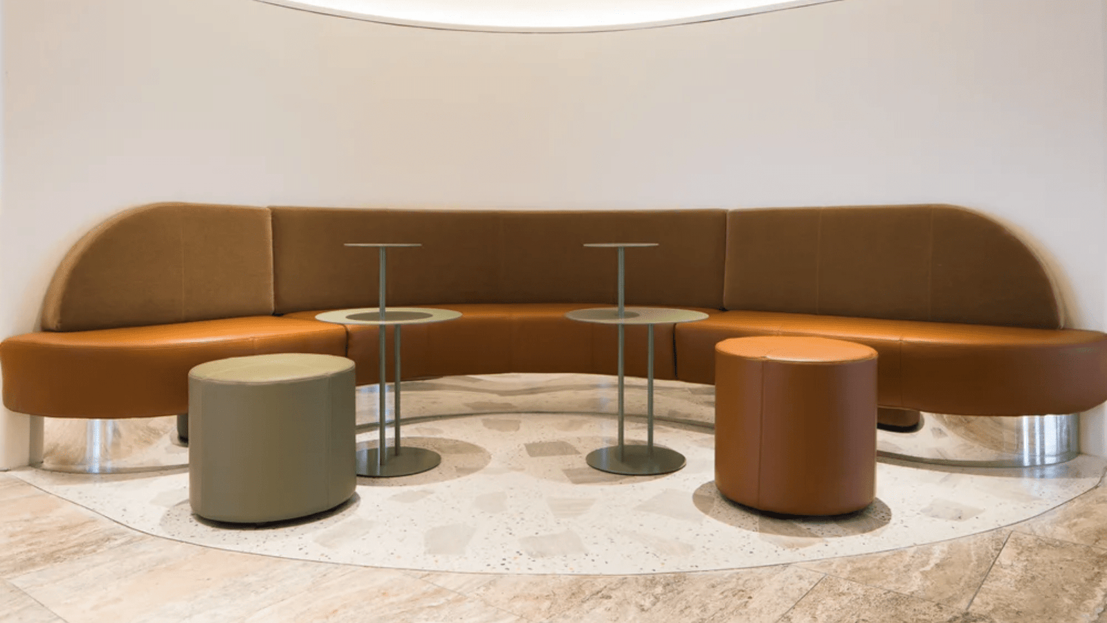
Balance of elements
Think of each mix as three parts: base tone, visible inclusions and surface finish. The graphic shows their relative weight.
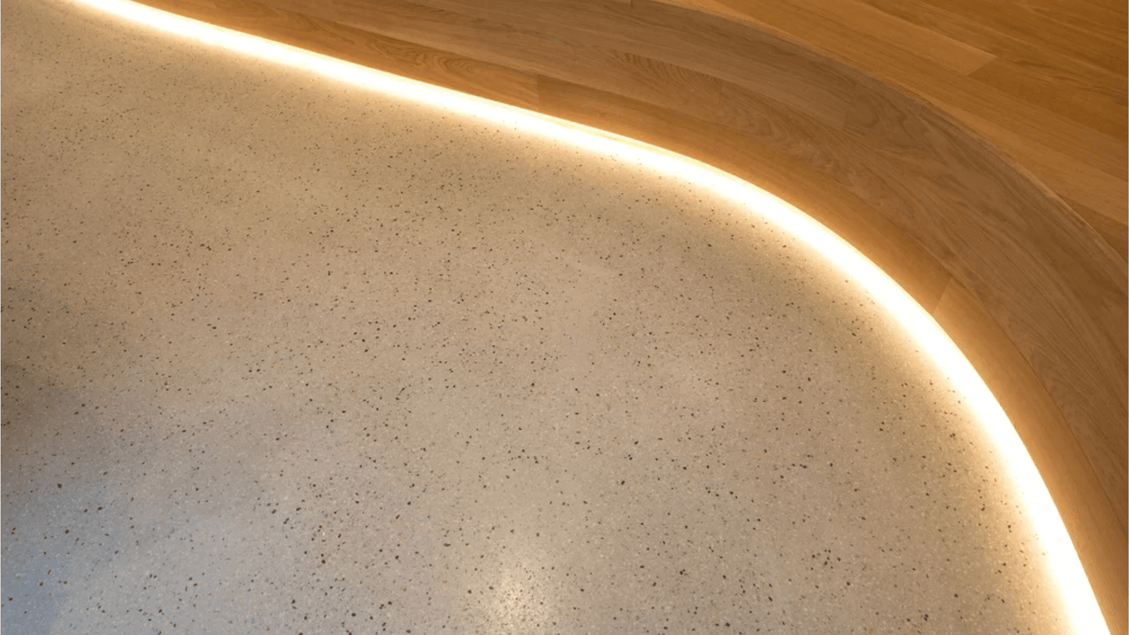
Base tone
Approx. 60%
Overall field that you notice first when entering the space.
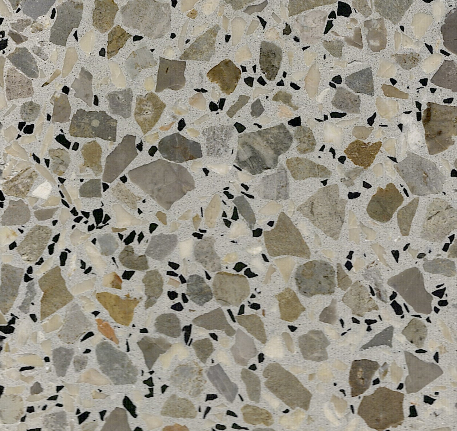
Inclusions
Approx. 30%
Granular elements that add movement, direction and scale.
Finish
Approx. 10%
Surface texture and sheen, adjusted to suit slip and cleaning needs.
Shade ladder
A simple ladder of three steps helps keep decisions consistent across the scheme.
Step A
Softest shade – reception, flexible work areas.
Step B
Mid shade – main circulation and shared spaces.
Step C
Strongest shade – feature areas and framing elements.
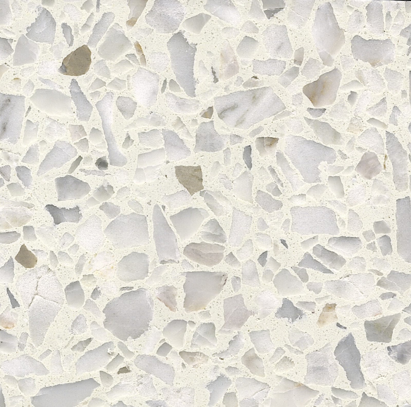
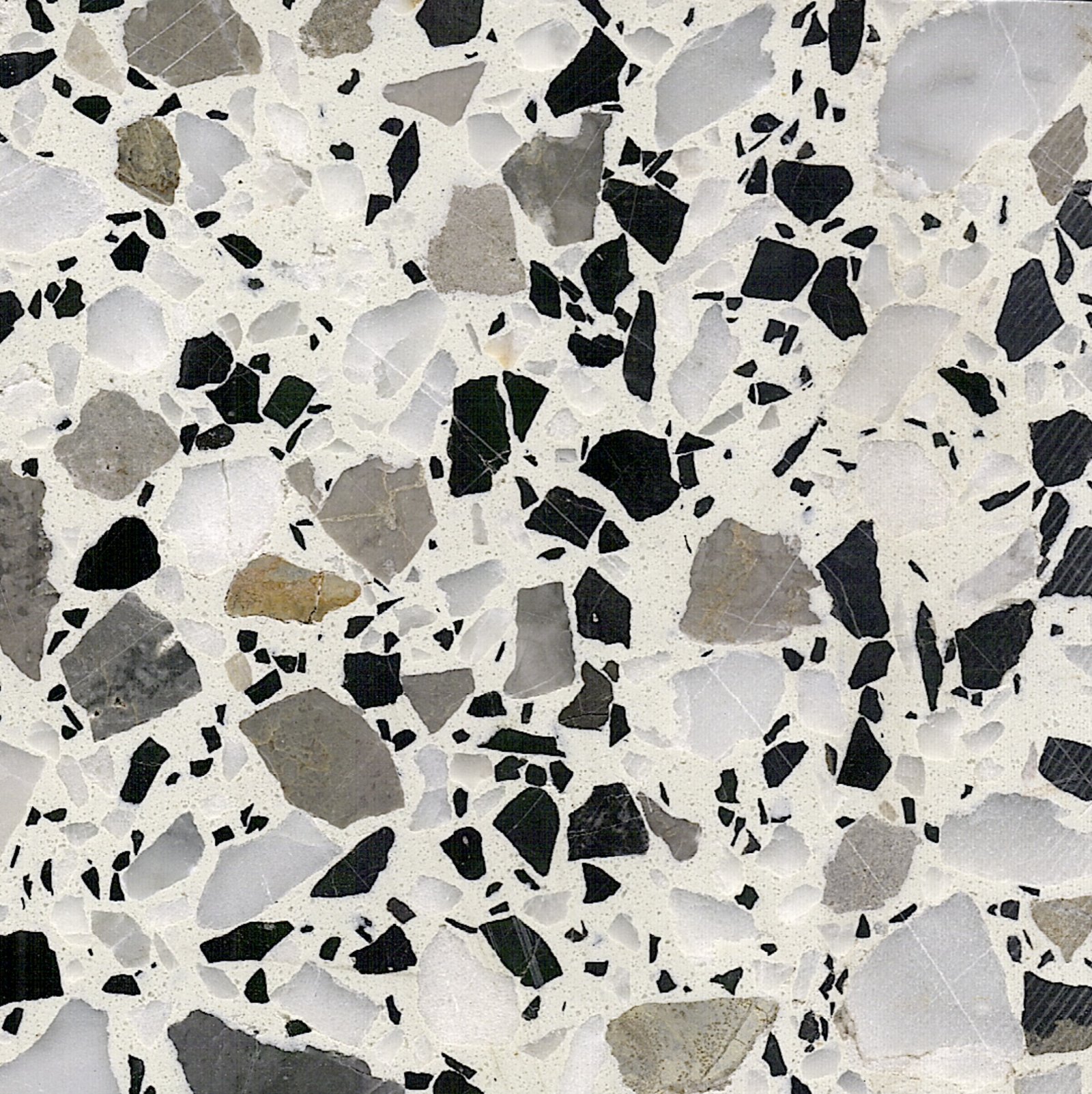
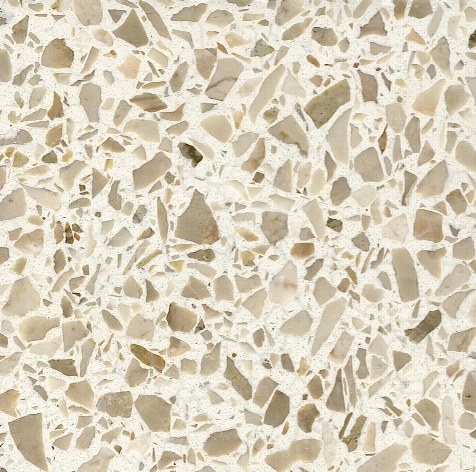
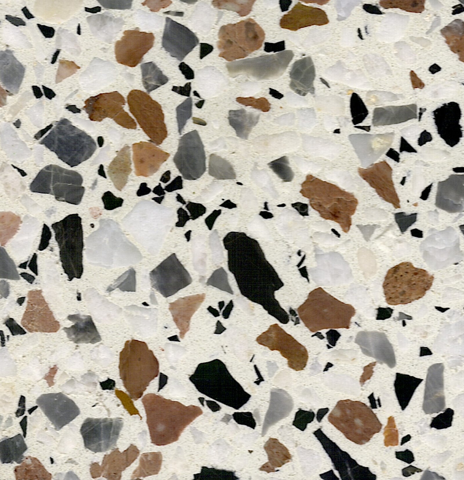
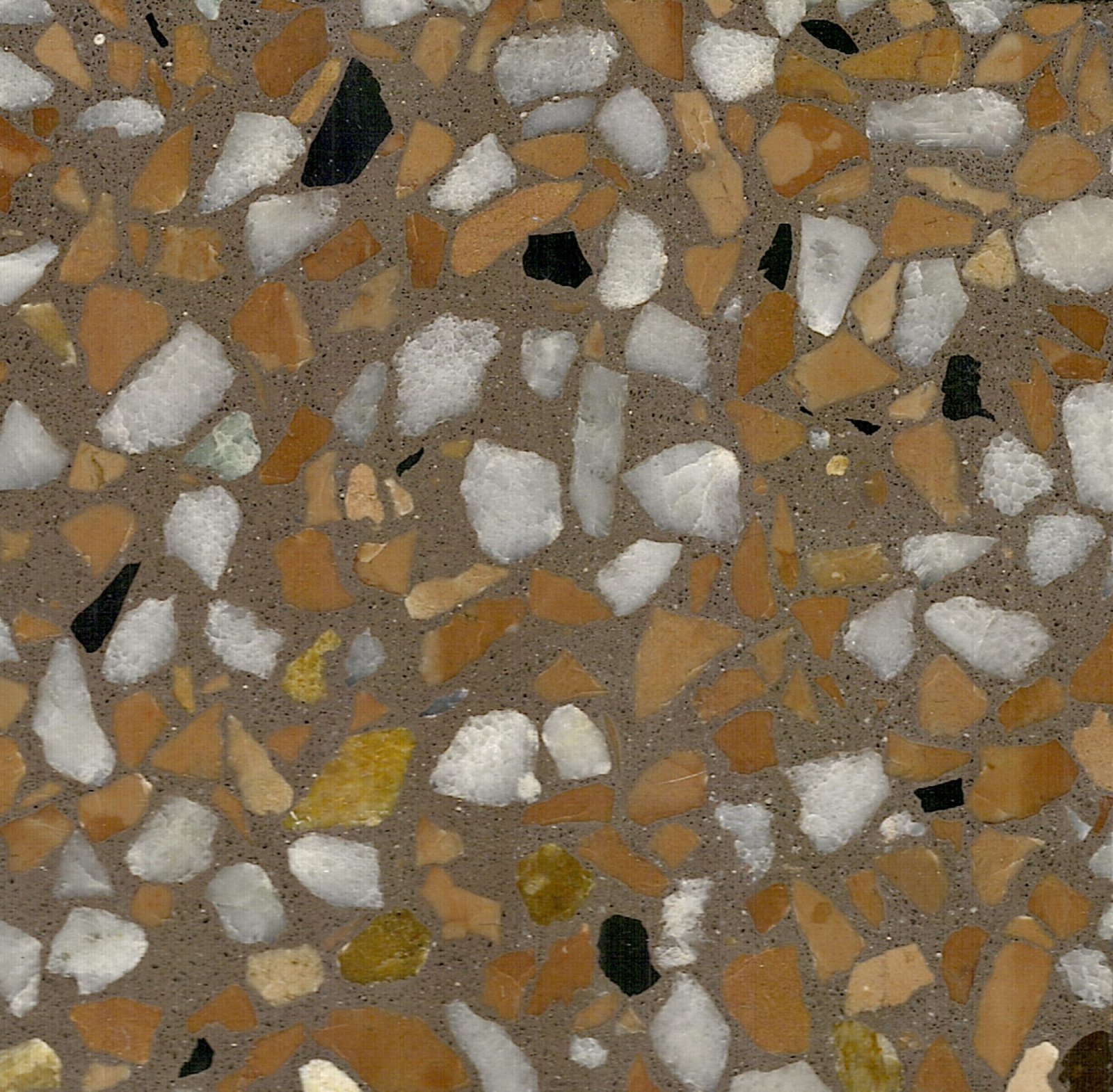
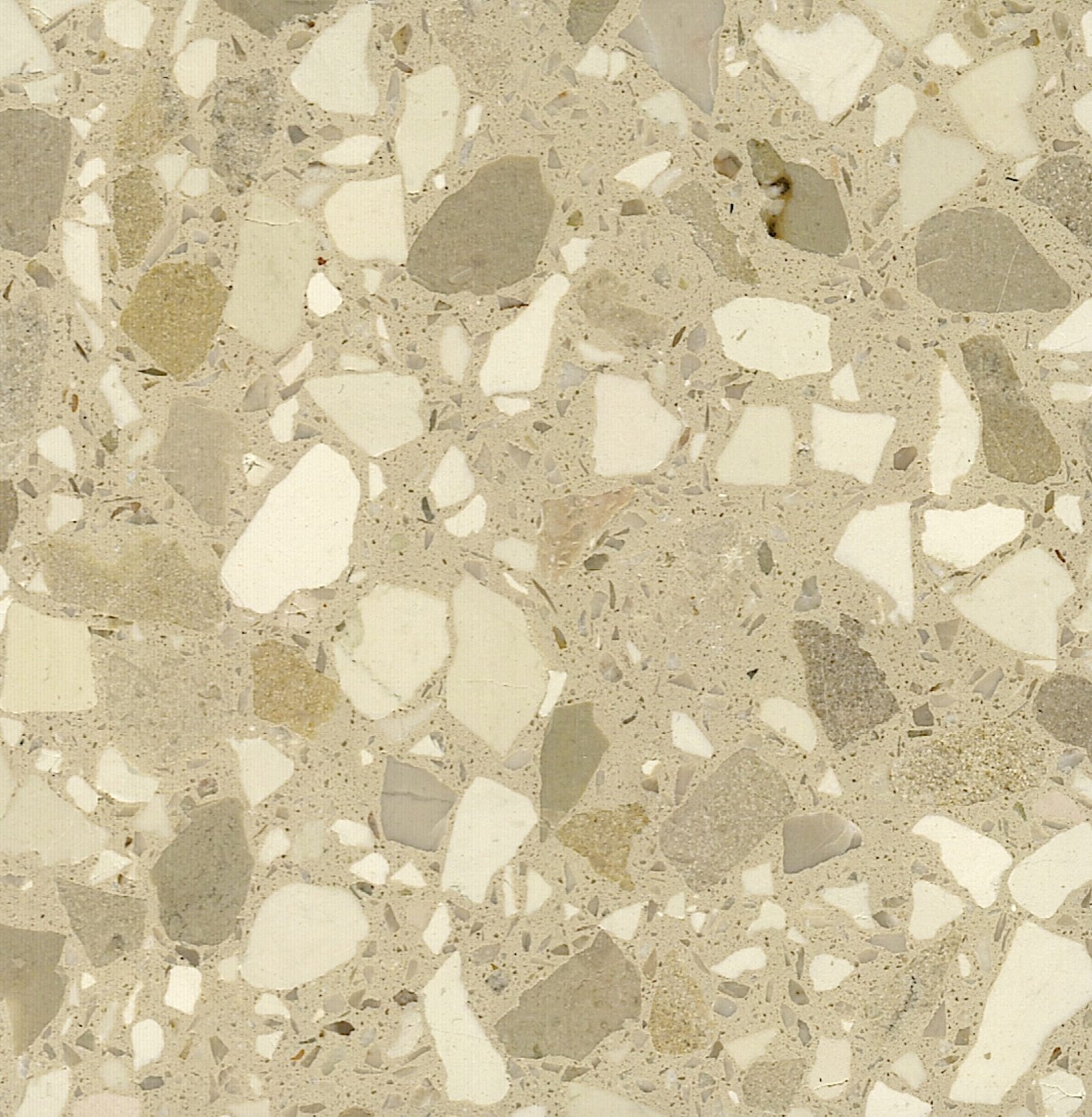
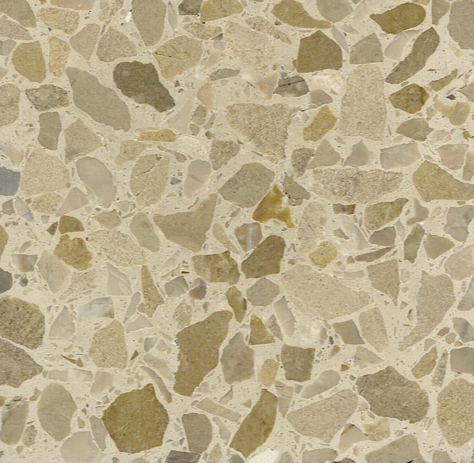
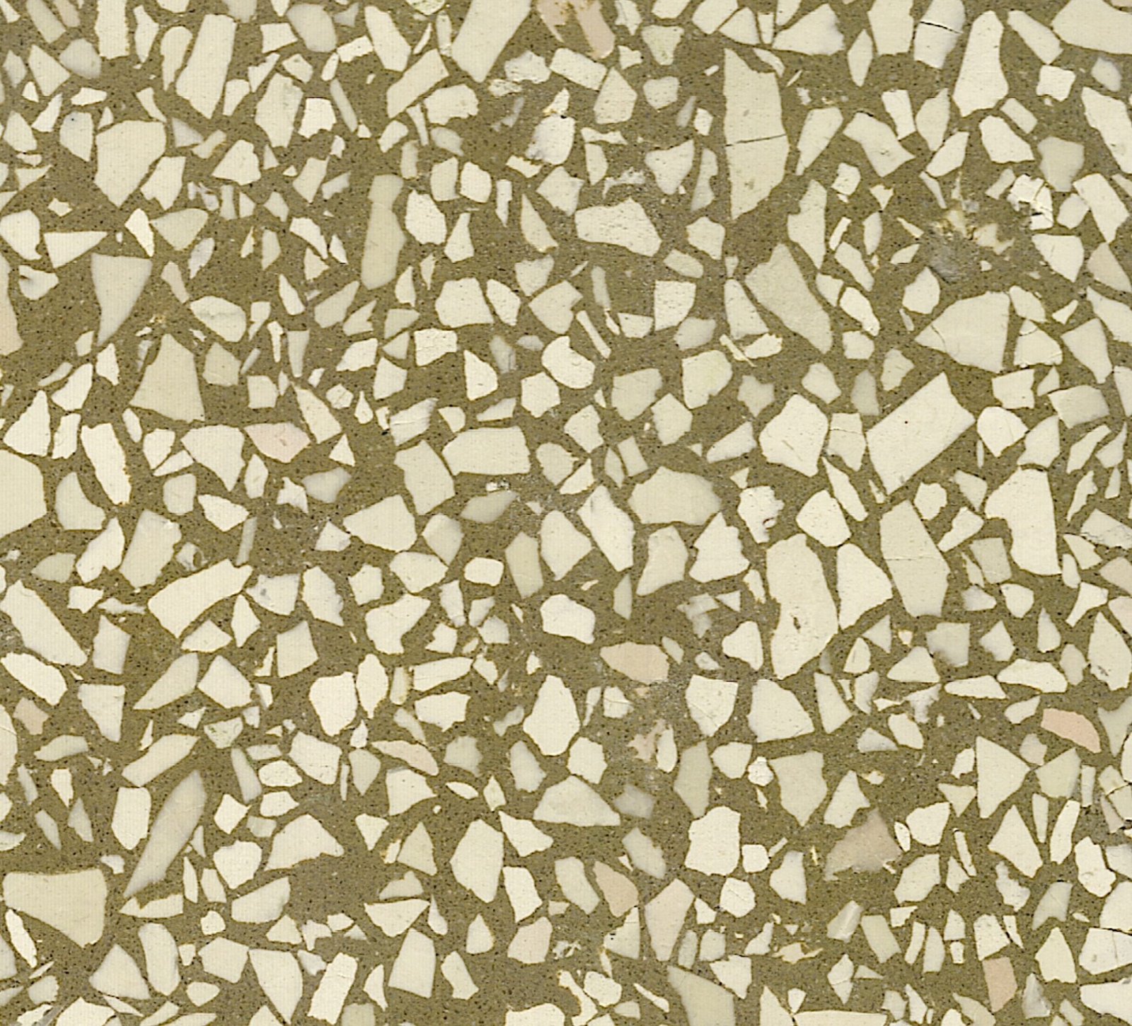
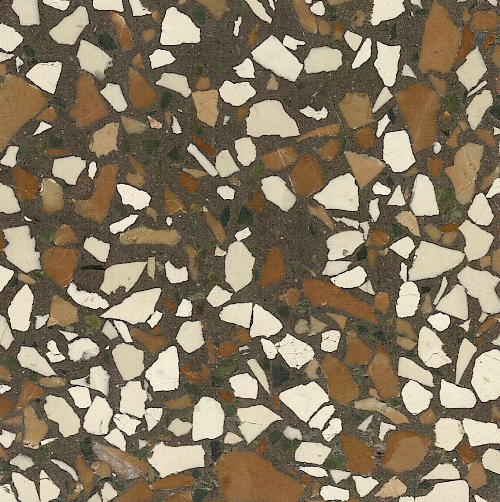
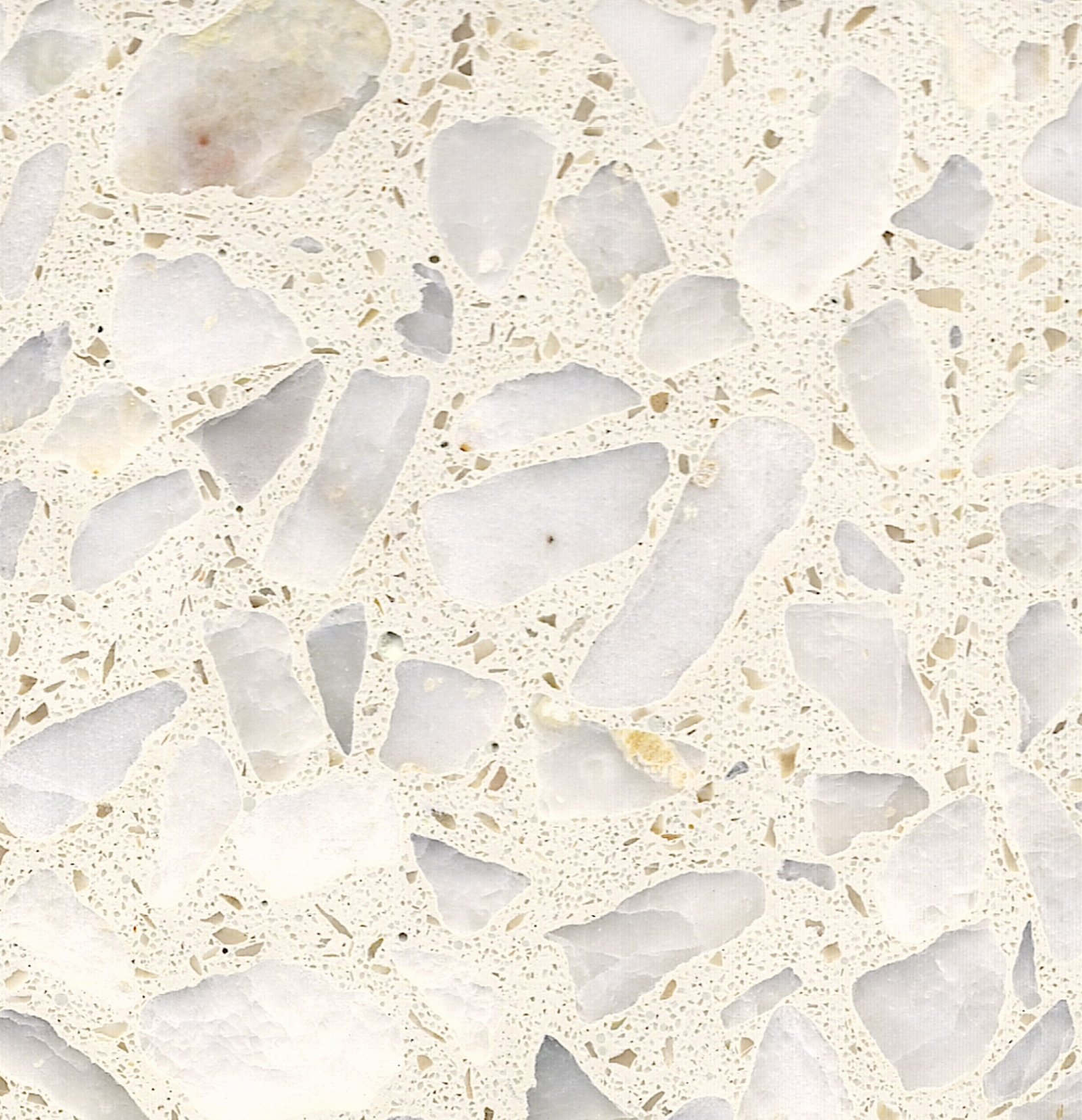
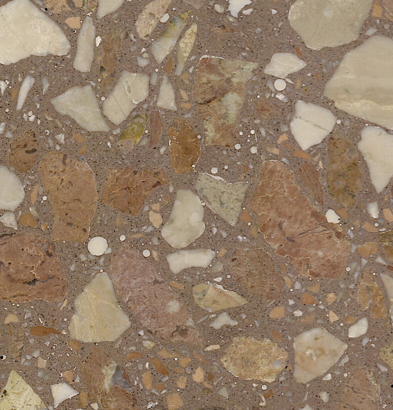
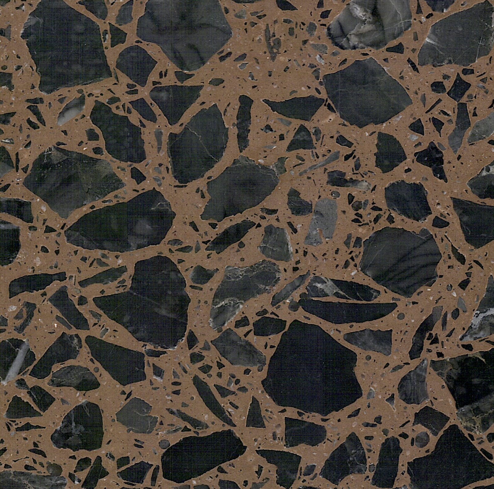
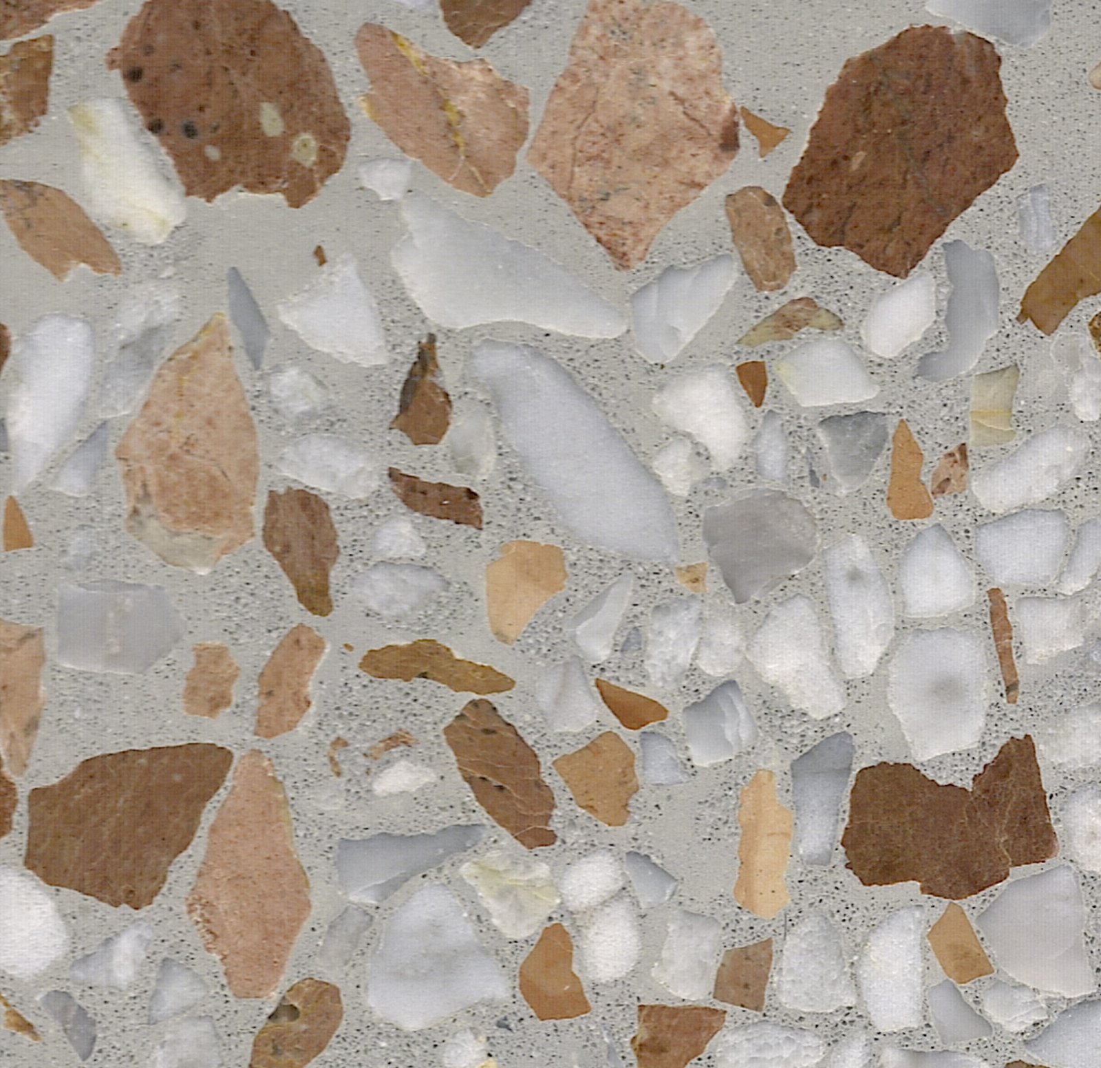
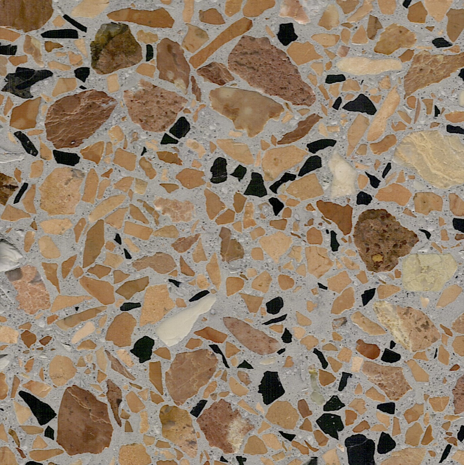
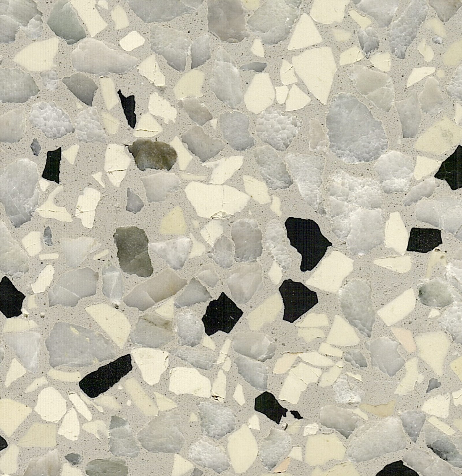
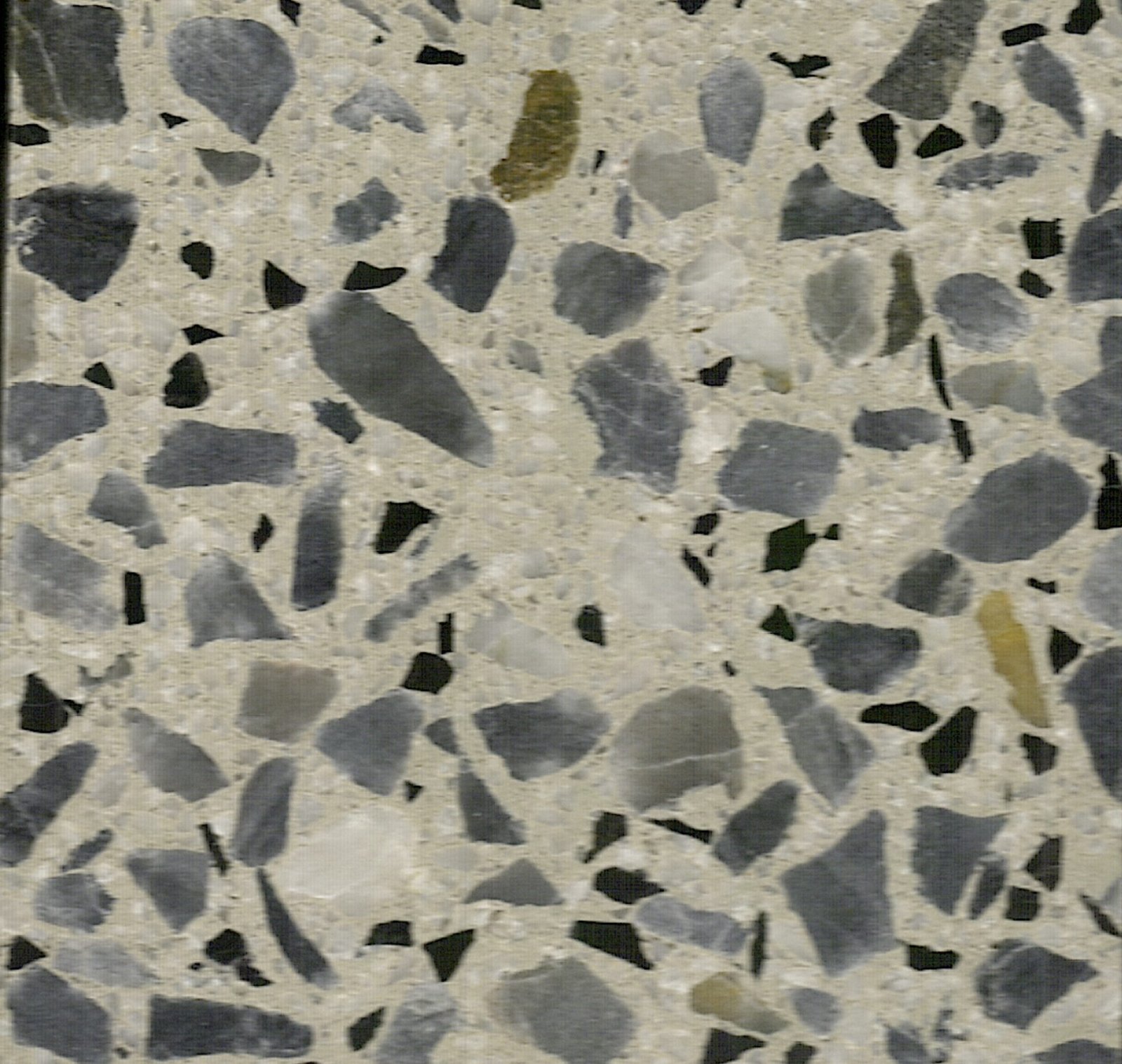
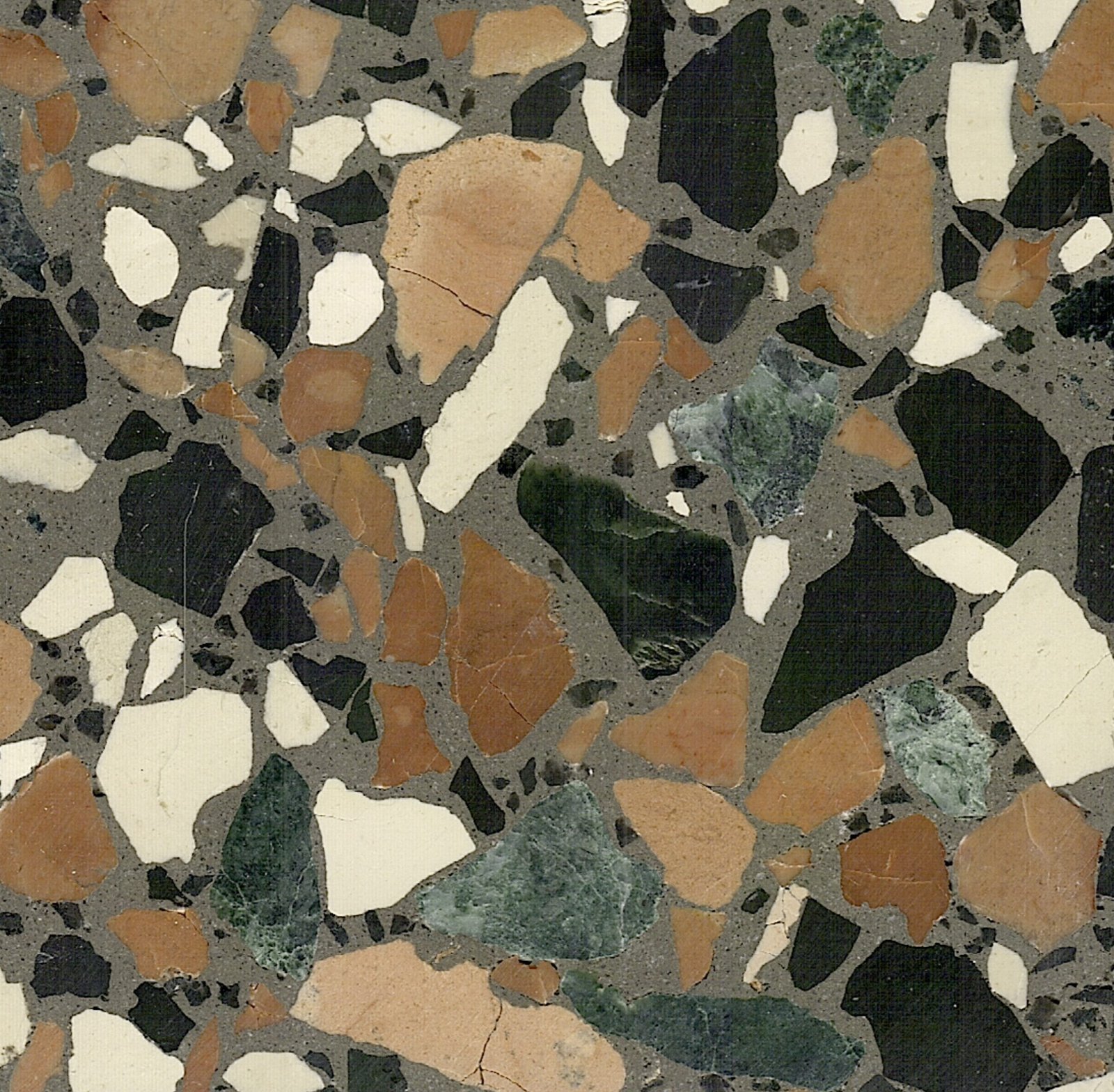
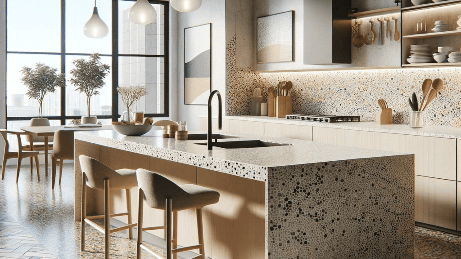
Collections overview
Collections group mixes by series and grade so you can move from soft and calm fields
through to highly expressive compositions, without relying on fixed names.
Series by use
Map each series to its most typical applications. This helps you narrow options quickly.
Series
Interior floors
Exterior slabs
Vertical surfaces
Series 01
High
Medium
Selective
Series 02
Medium
High
Medium
Series 03
Selective
Medium
High
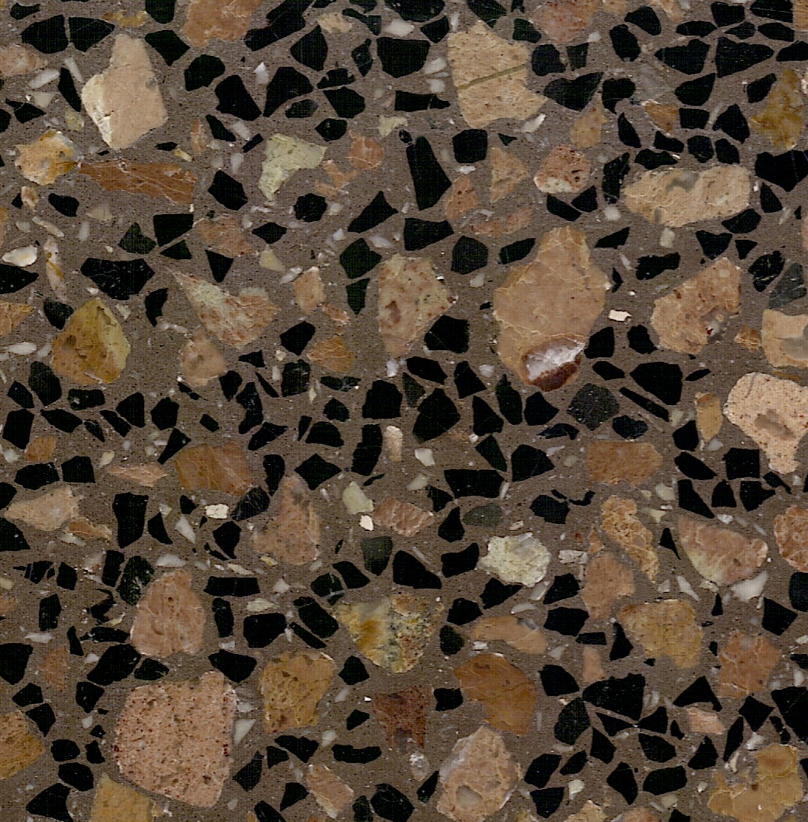
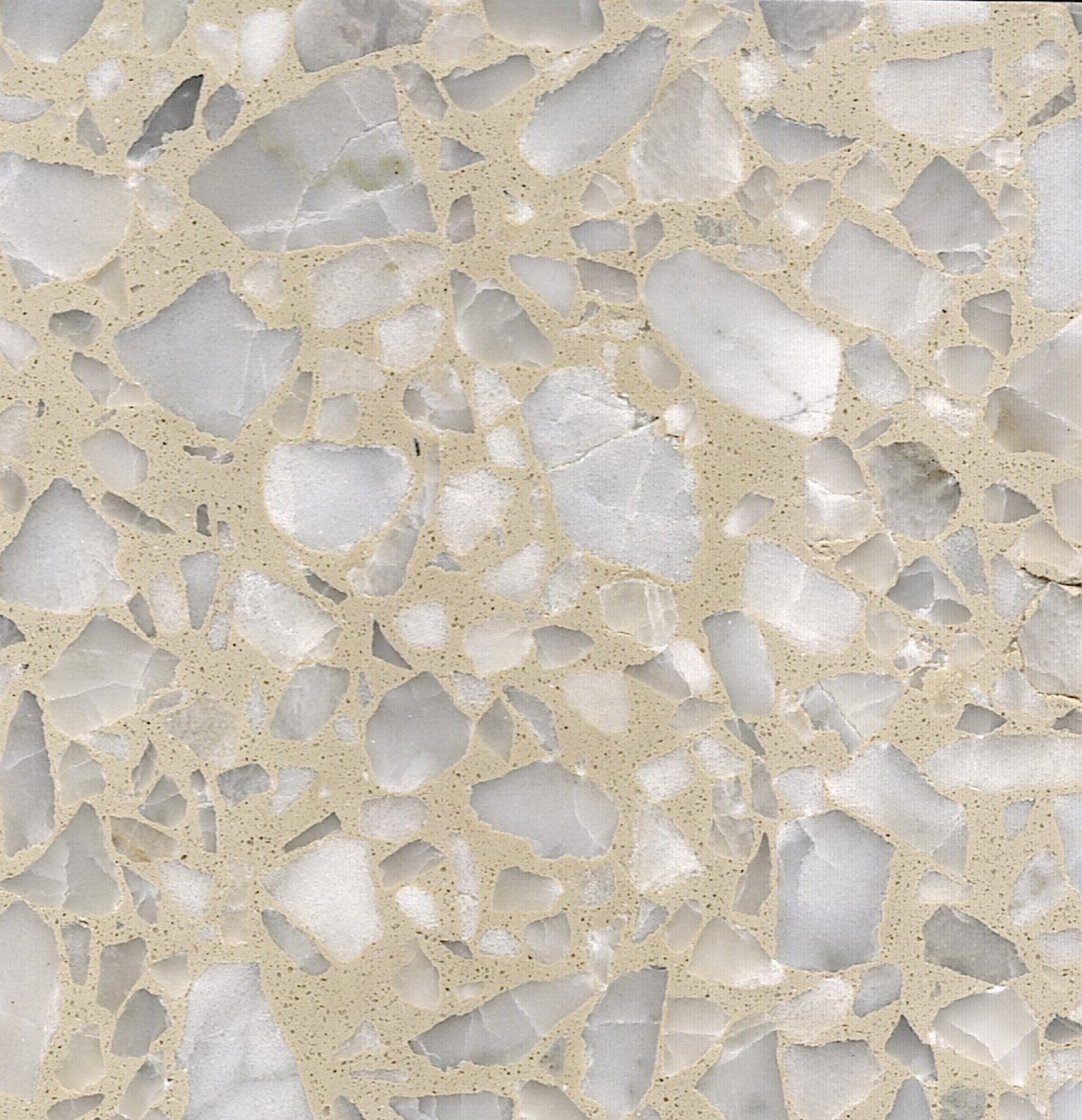
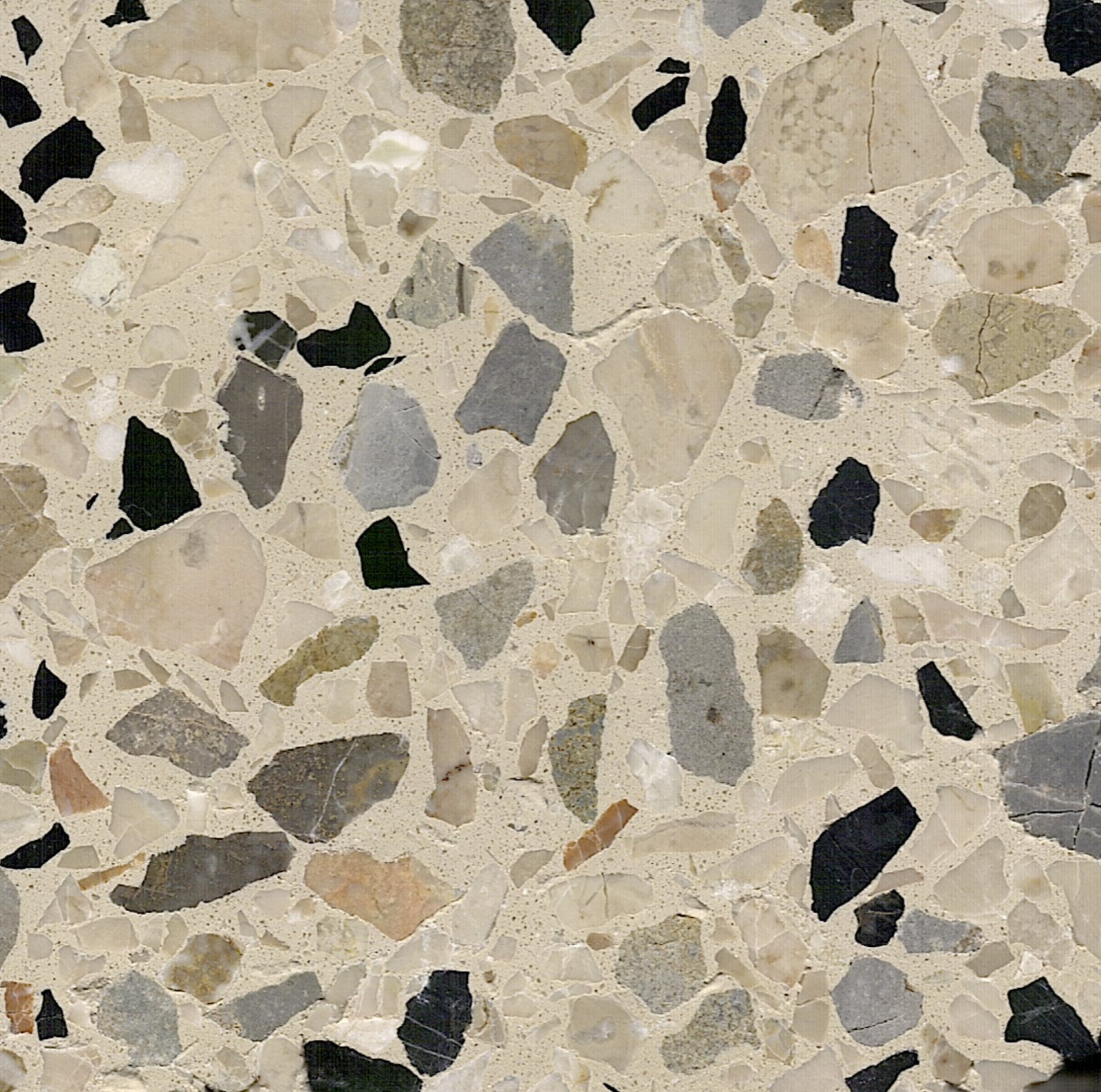
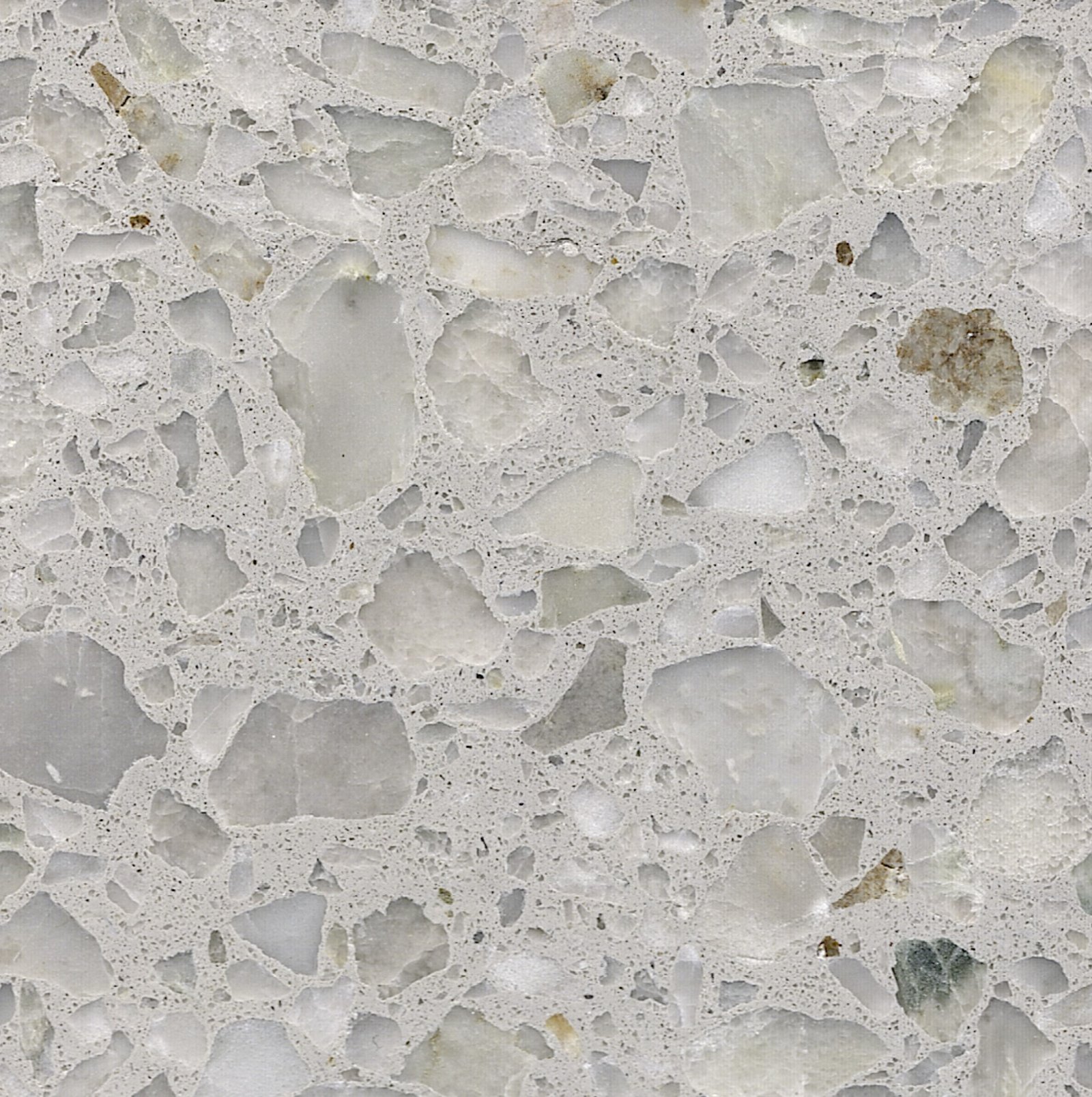
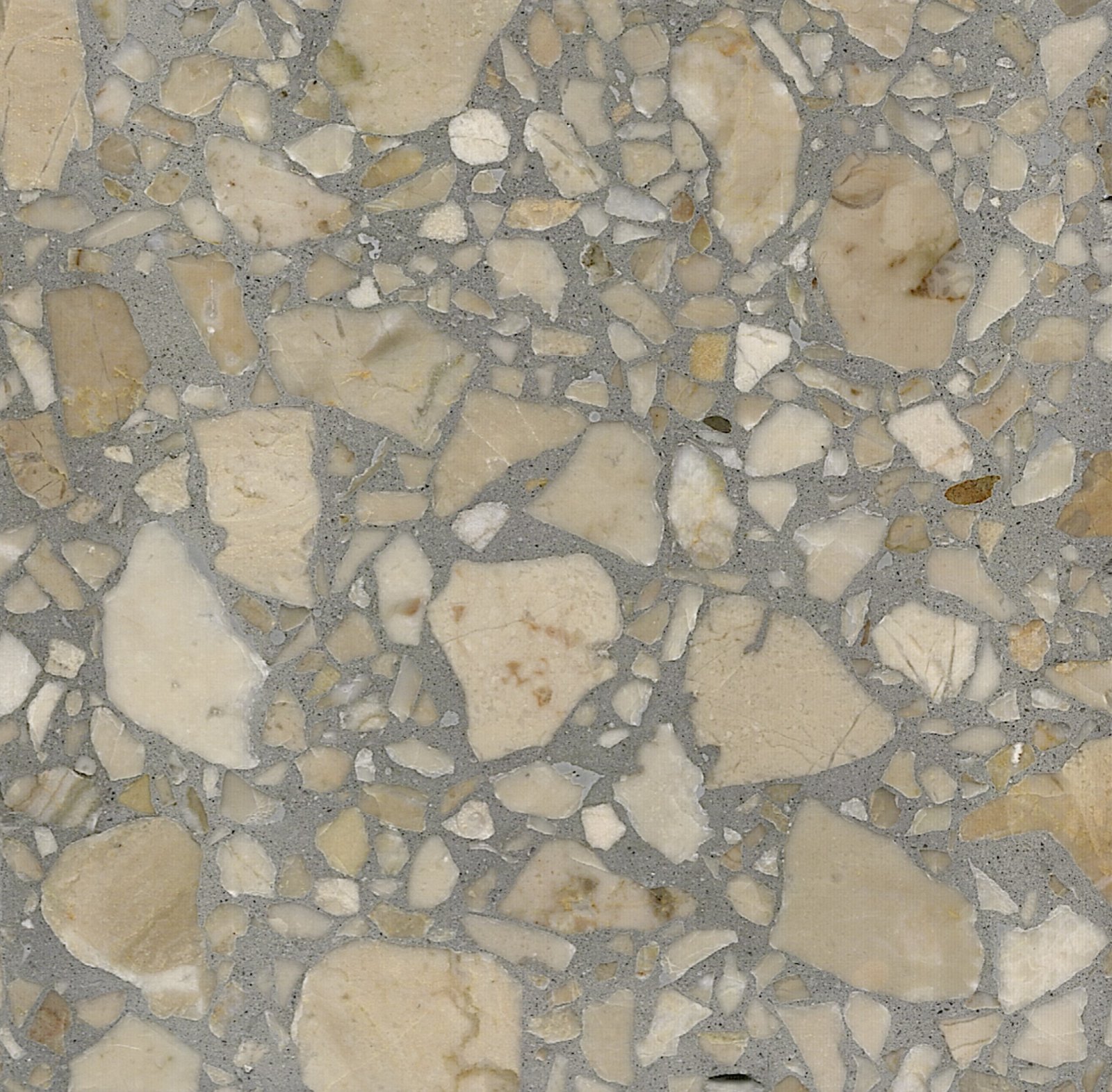
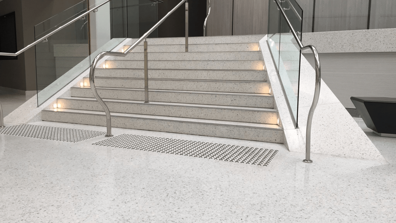
Grade legend
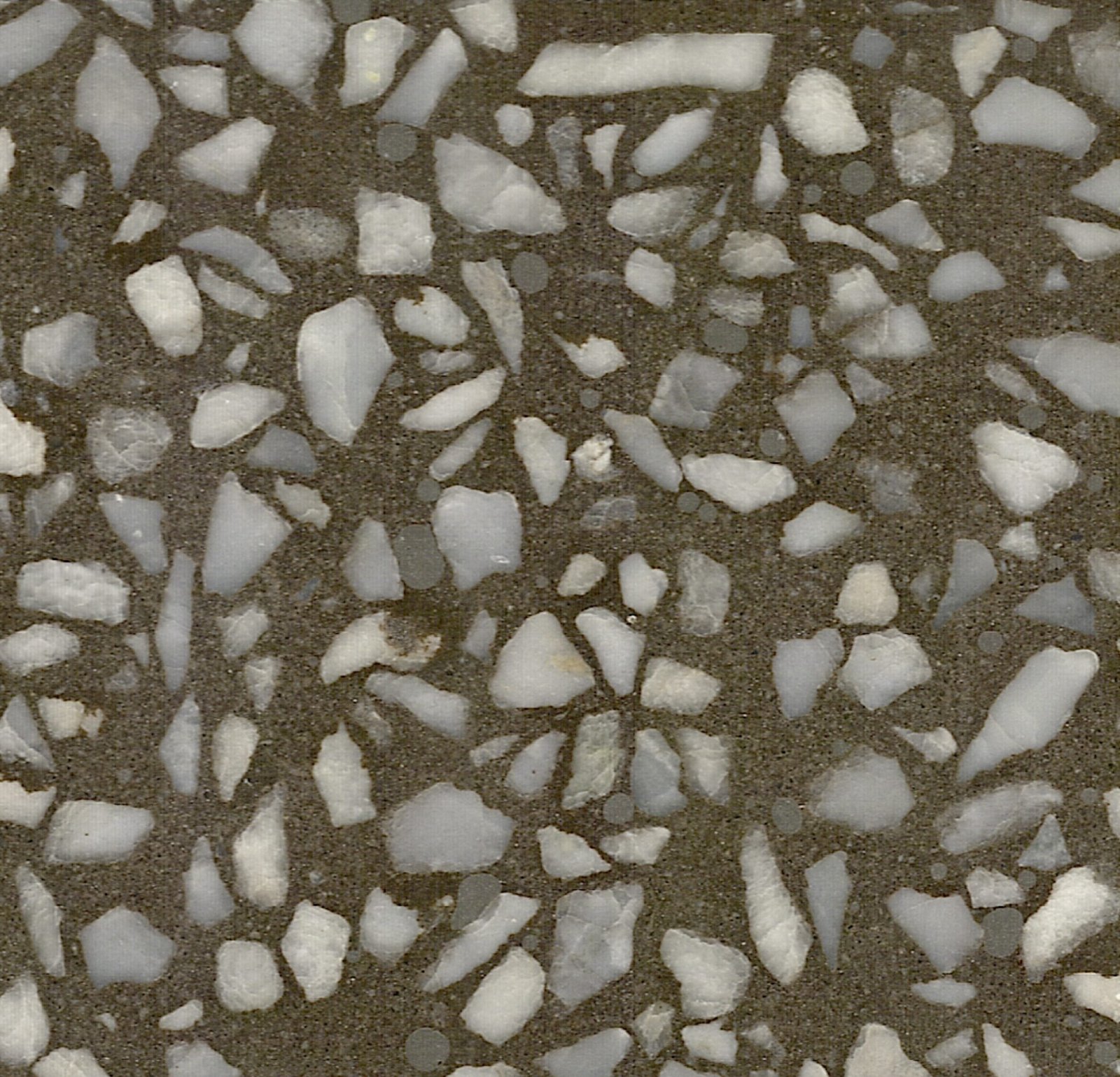
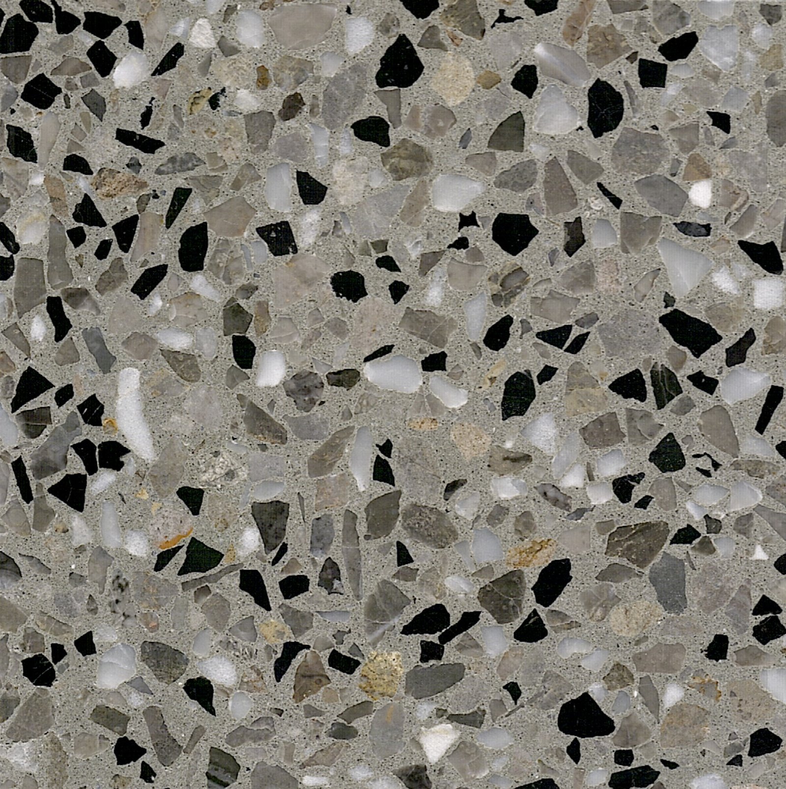
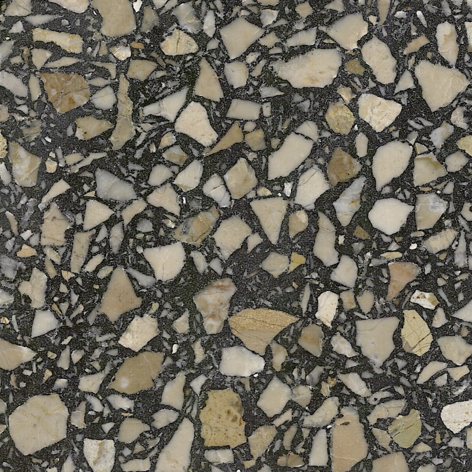
Grades describe how much movement you see from aggregates and how open the field appears.
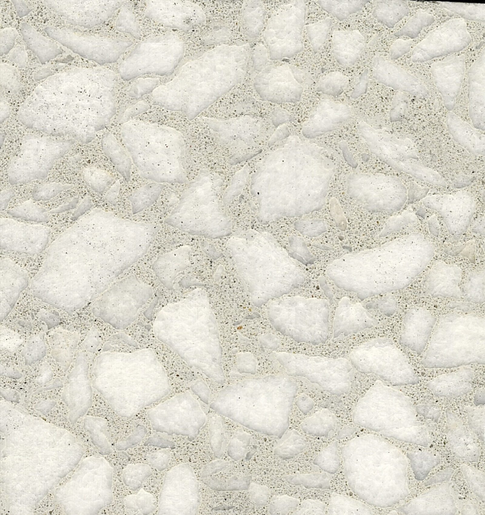
Fine
Dense, small inclusions for a smoother, more uniform read.
Classic
Balanced expression suitable for most interior and exterior slabs.
Sparse
More open field with inclusions used as quiet points of interest.
Aspect
Directional or feature-driven look, used where you want a stronger statement.
Recycled
Mixes that incorporate reclaimed content for circular design goals.
Project checklist
Run through this checklist when shortlisting options with clients or project teams.
✓
Confirm tone hierarchy: background, primary areas and key accents.
✓
Match grades to slip, cleaning and durability requirements.
✓
Decide where recycled or specialty mixes will be most visible and meaningful.
✓
Request project-specific samples for the exact finish and aggregate exposure.
This website uses cookies to improve your web experience.
